PROJECT OVERVIEW:
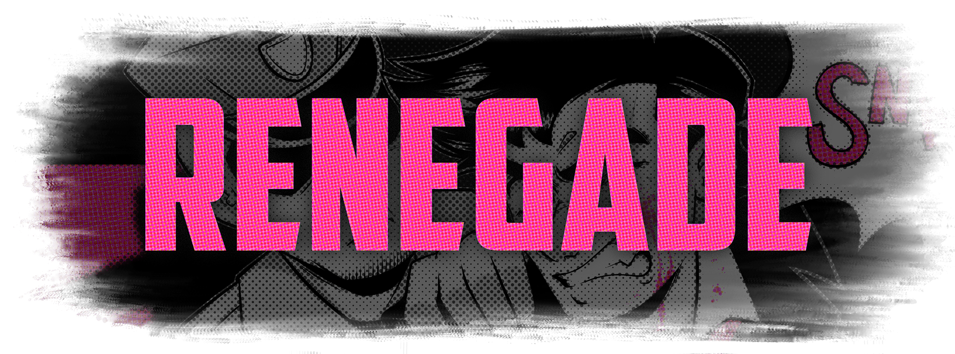
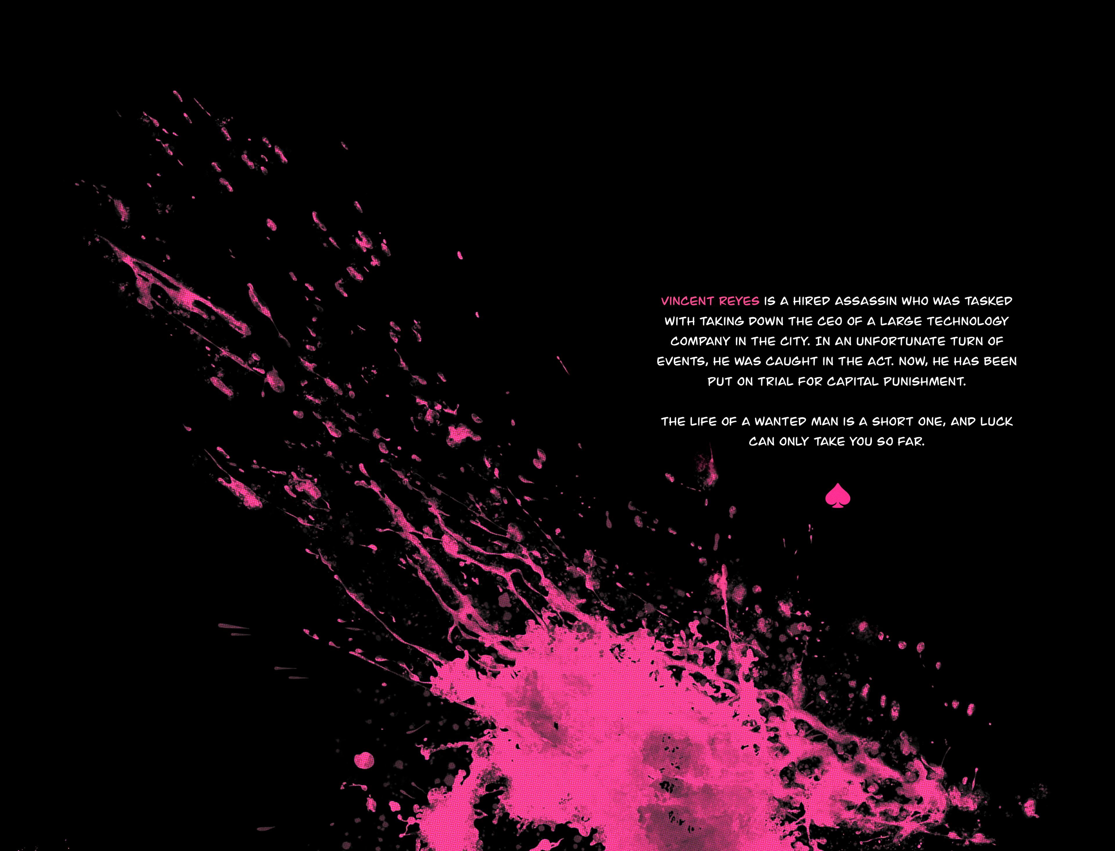
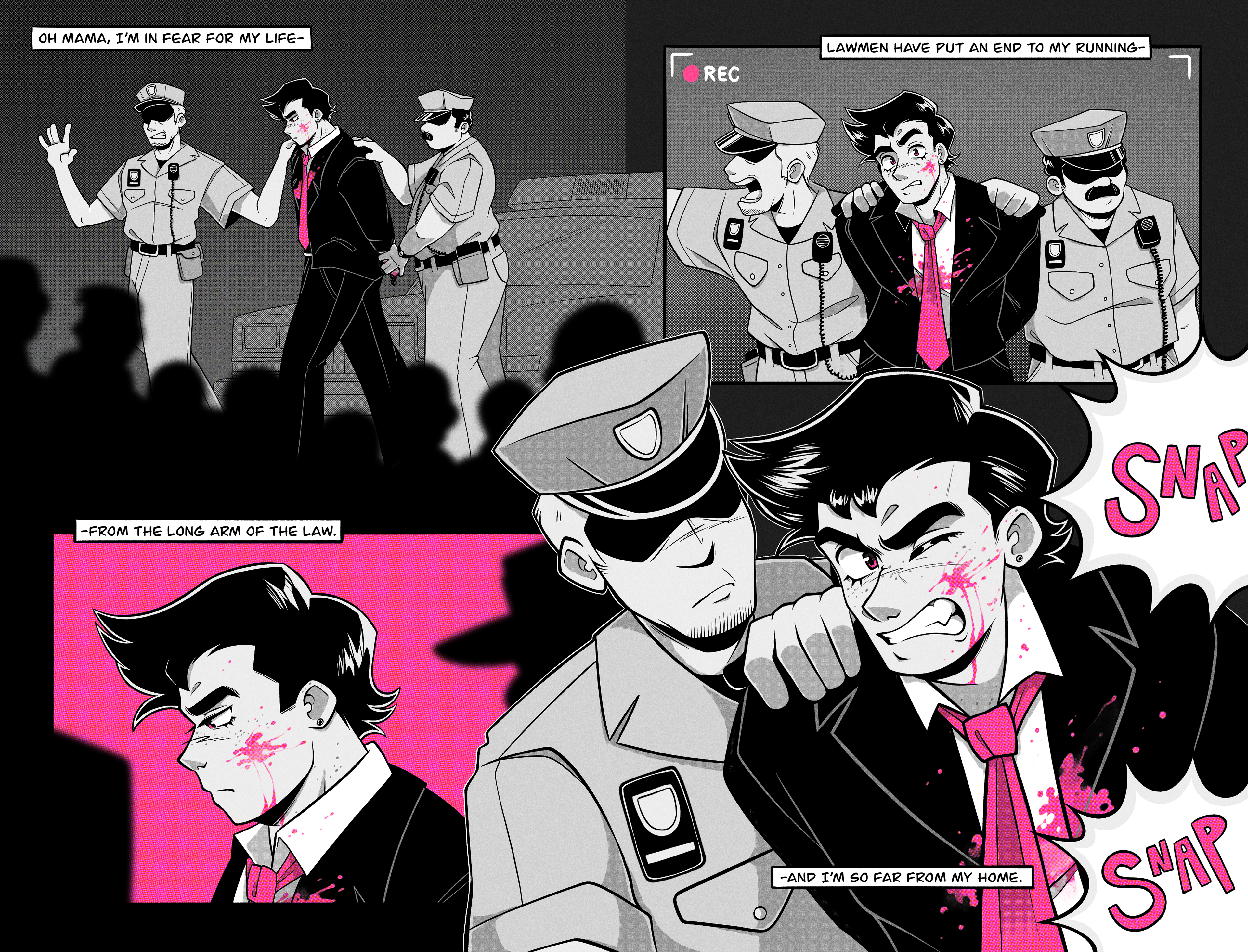
Renegade is a 12 page mini comic that uses the song "Renegade" by Styx as its visual narrative. The story explores the story behind hired assassin Vincent Reyes as his world quickly begins to fall apart.
IDEATION:
The style of the comic itself takes lots of inspiration from common graphic novel design traits such as a limited color palette, use of halftones, and texture. Although the style tackles inspiration from these traditional characteristics, it still feels unique in how the compositions of each spread is designed.
DELIVERABLES:
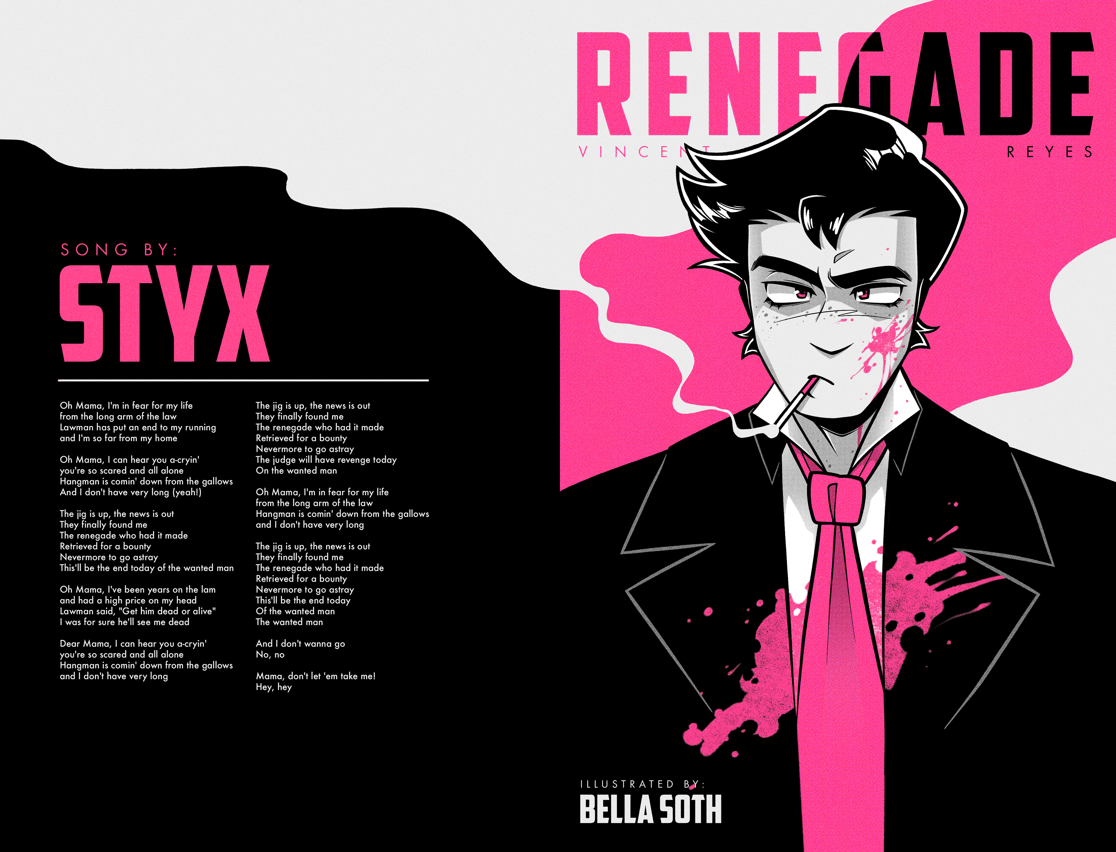
Front and Back Cover
Pages 1-2
Pages 3-4
Pages 5-6
Pages 7-8
Pages 9-10
Booklet Spreads
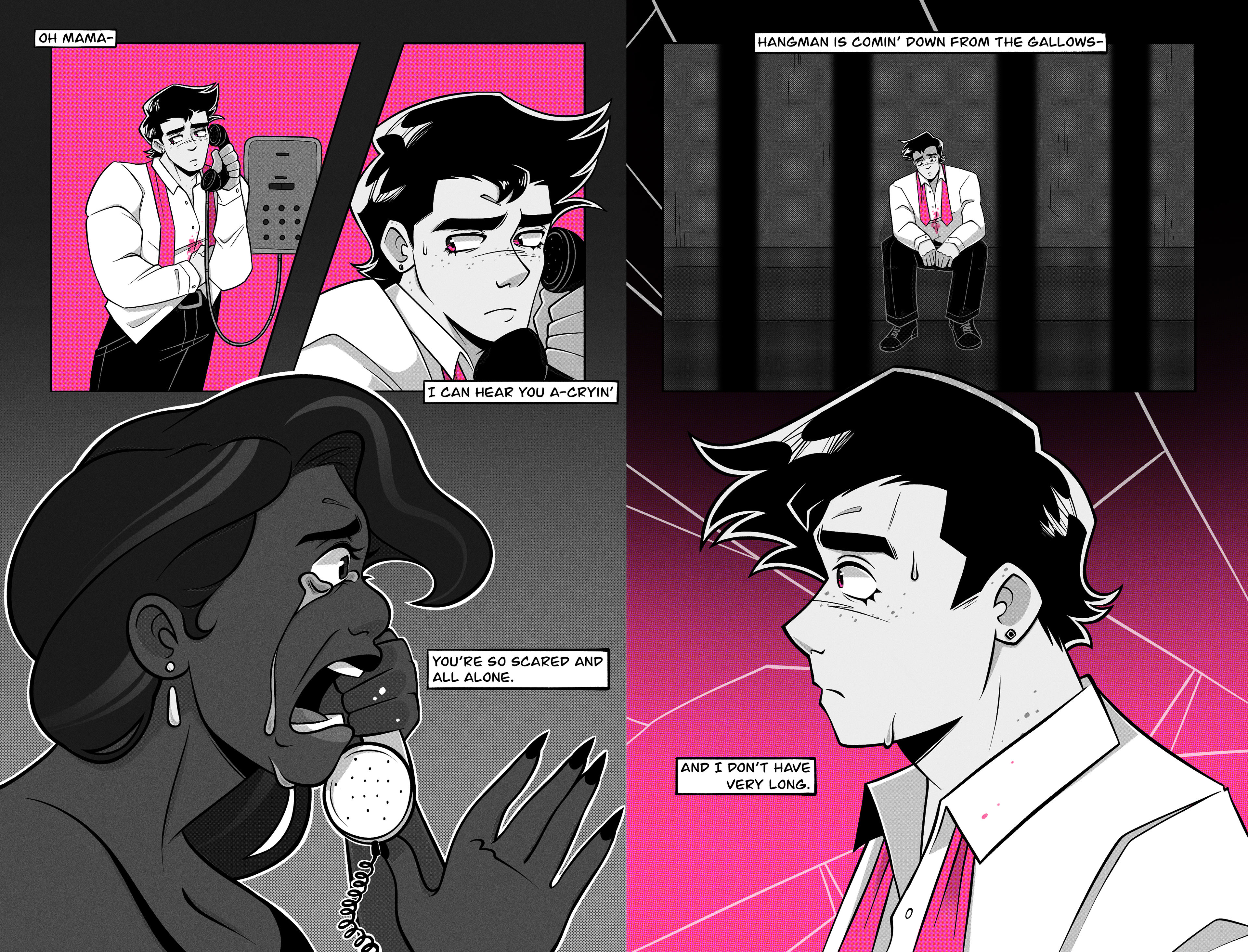
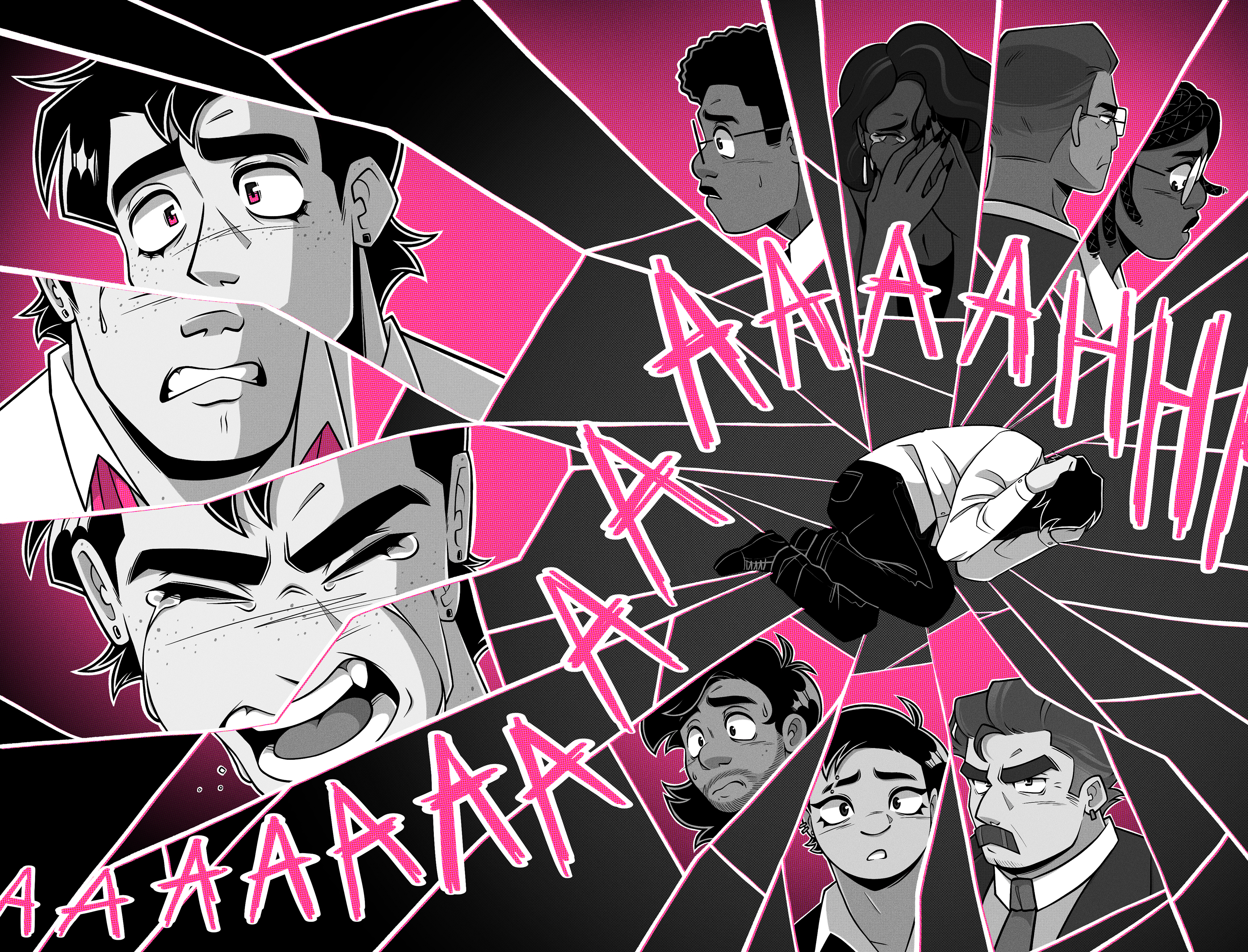
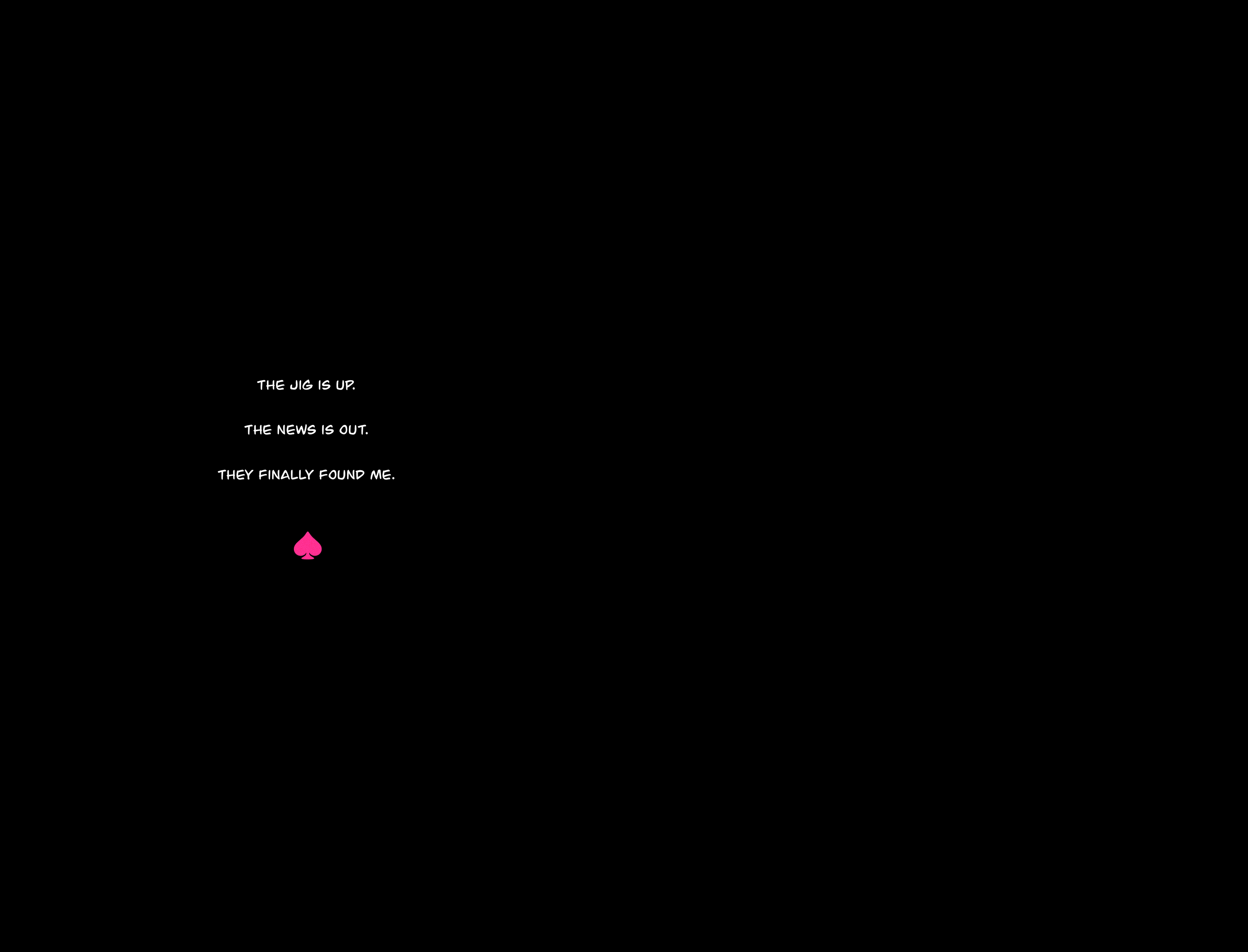
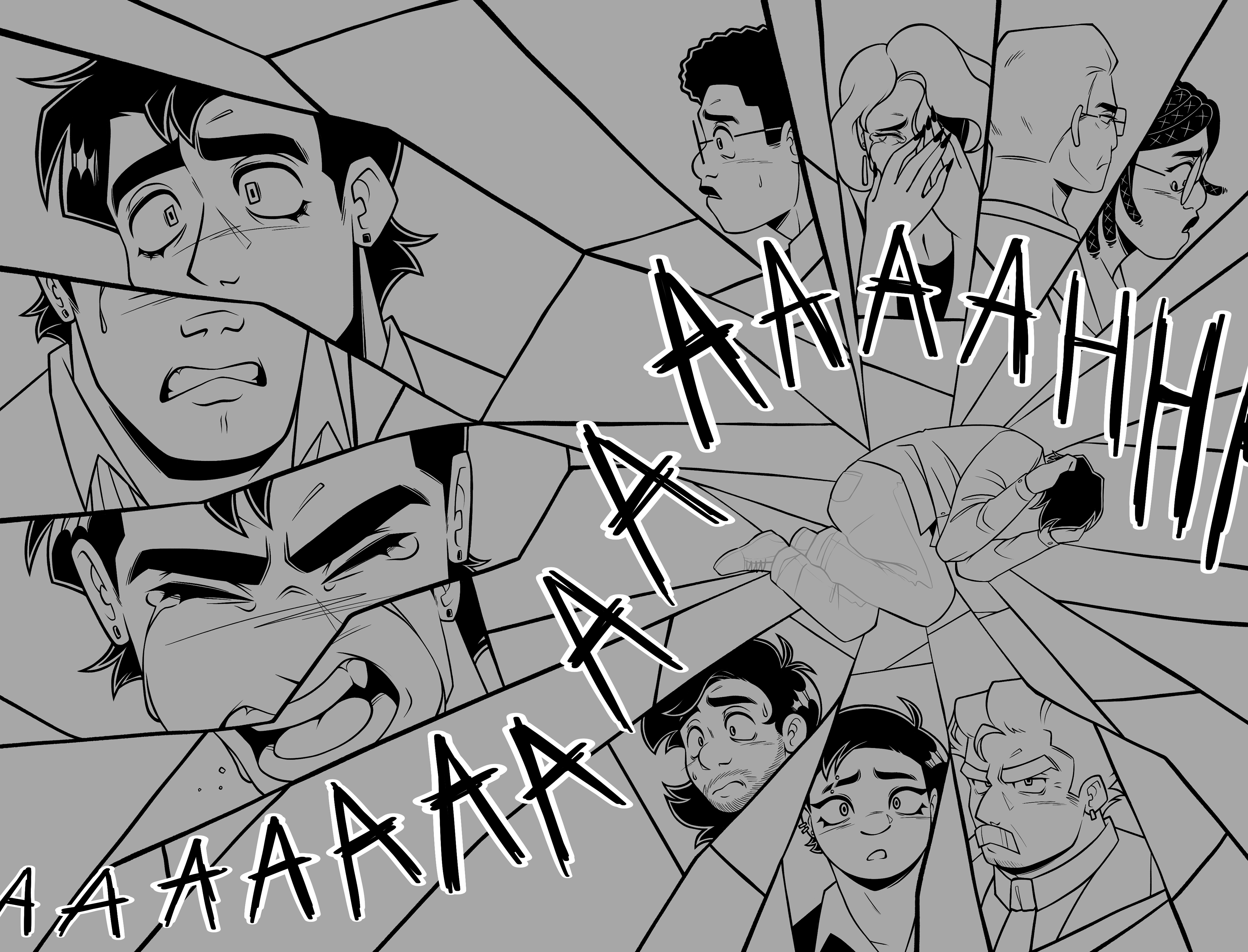
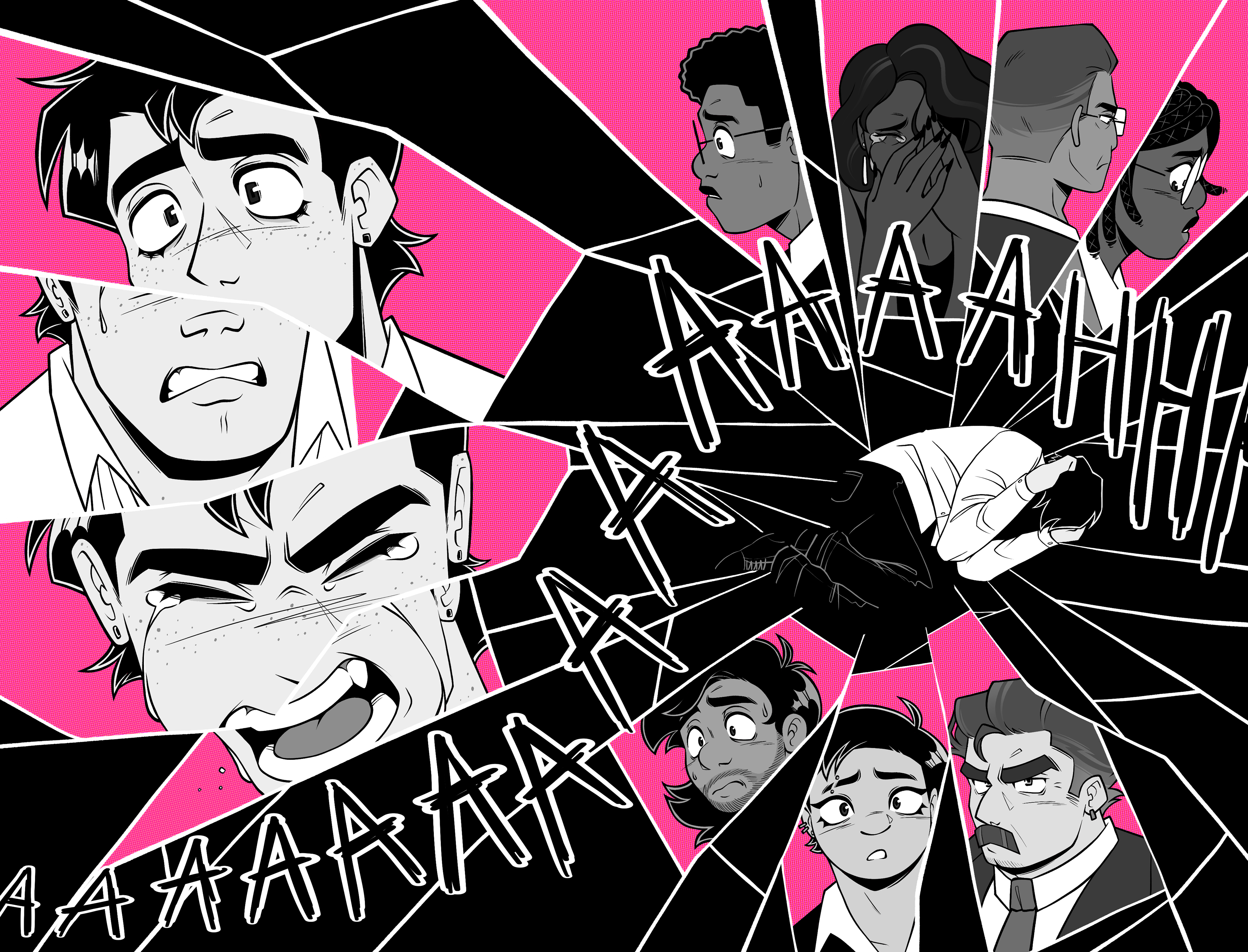
The final spreads for the mini-comic showcase a wide range of tone and emotion as the reader goes through the narrative arc. The final iteration of the ending was changed to be more open ended so the reader would be left wanting more. Instead of being framed for murder, Vincent would be overwhelmed with a sea of emotions as he realizes the gravity of his situation. An introduction was also added in the final design for additional context, so the viewer doesn't feel lost.
PROCESS:
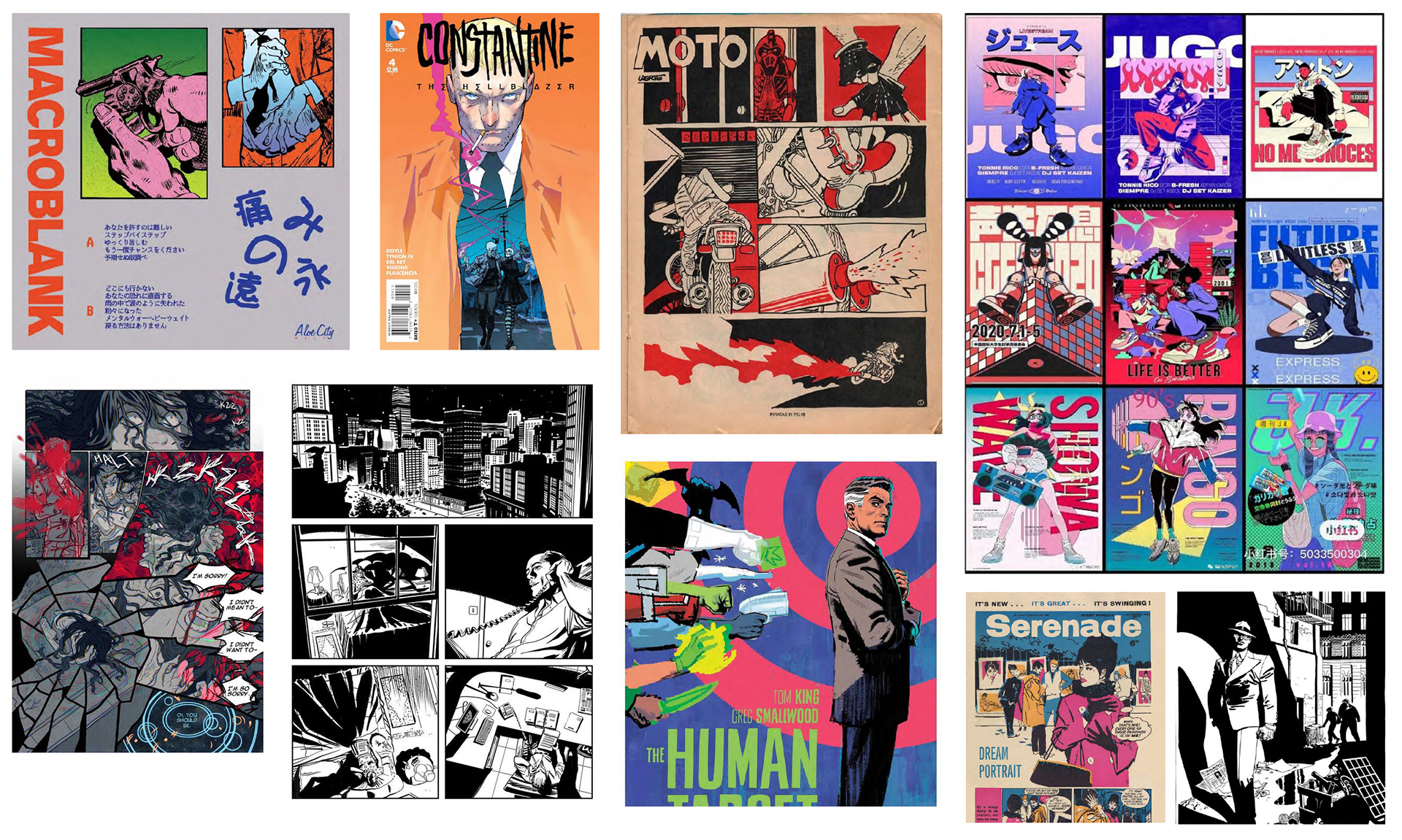
Territory Board
Before any drawing was begun, a territory board was formatted to explore the tone-of-voice and coloring style for the mini-comic. Many of the images here use bold coloring to interest the viewer, which was carried out throughout the design process. This board created many ideas of how the composition of the spreads would be crafted.
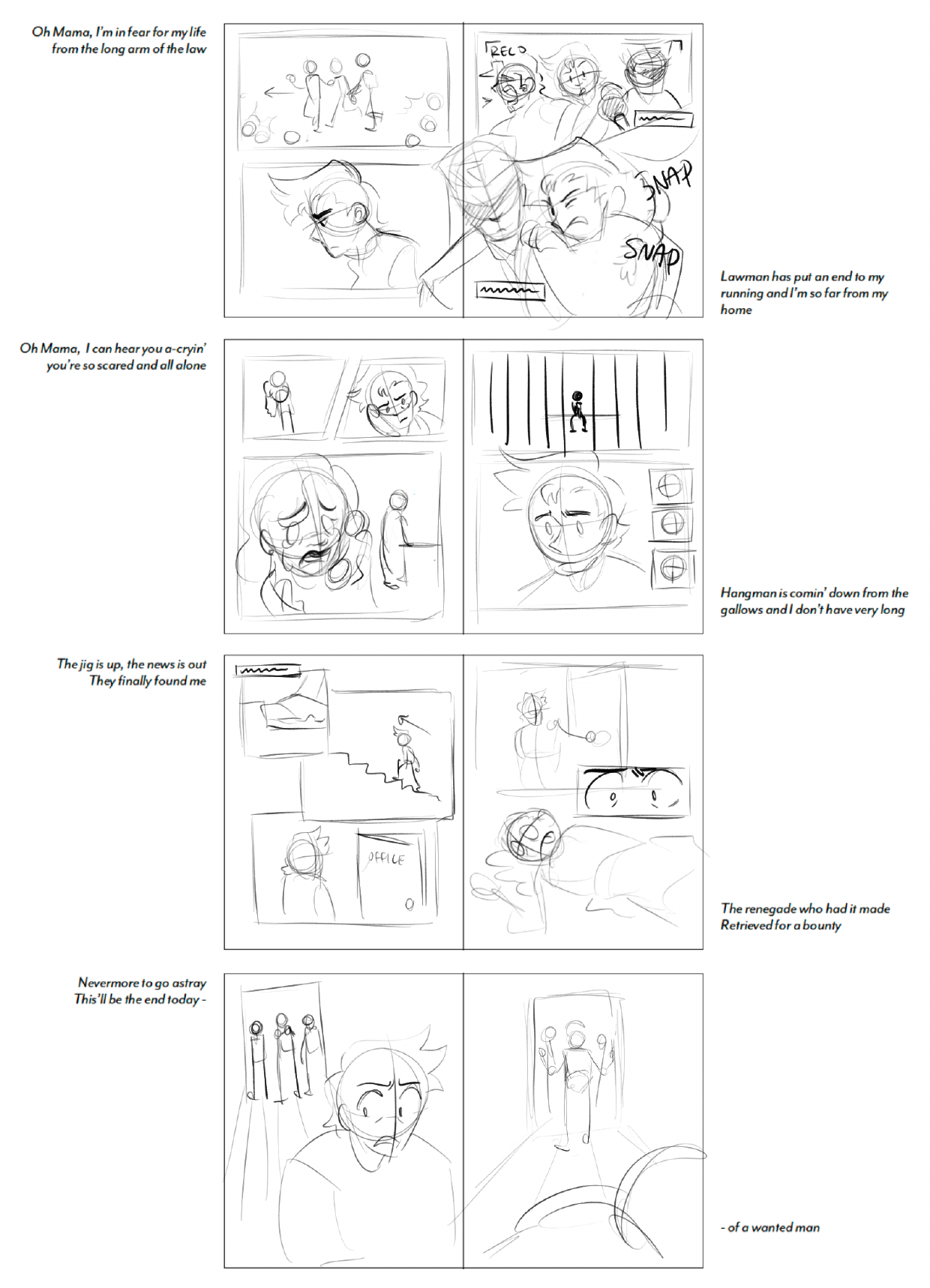
Storyboard Concept
Since this project was going to utilize written words from the song "Renegade", a storyboard was created to plan when each lyrical line would occur in the booklet, and a general idea of what visuals would be present. This was the first draft concept, so the placement of lyrics and visuals are slightly different from the final iteration.
The biggest change that was done were the last two spreads, which was scrapped. The original ending was a small flashback from a few hours before the comic begins. The main character, Vincent, had found a body and was immediately be taken into custody by the police, making it seem that he was framed for murder. This was soon scraped due to the story not flowing successfully, and wanting to have the ending be more vague.
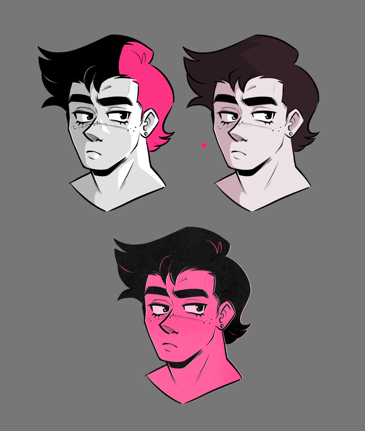
Art Style Explorations
The art style of the booklet then needed to be explored. Three general concepts were created, exploring the usage of pink, black, and grey as a color palette. Pink was decided to be used as the only actual color for its similarity with blood, without coming across as too violent and horror-like. Pink also added more personality to Vincent in general, as it is commonly associated with his character. The first exploration was the strongest; it utilized pink in a subtle yet bold way, and including jet black for the hair made the contrast of the character much more interesting.
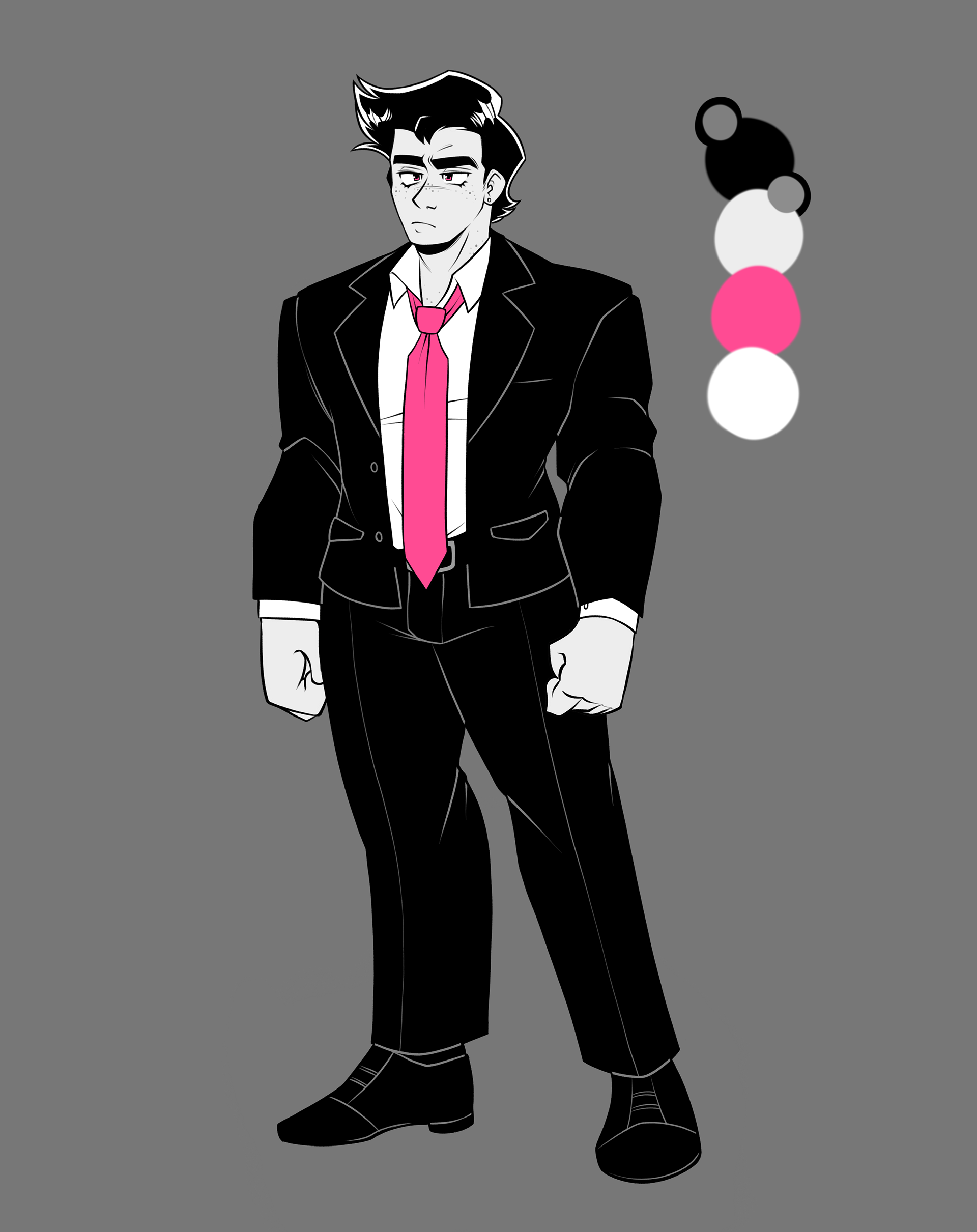
Vincent Reference Sheet
In order to ensure visual consistency throughout the story, a character sheet of Vincent was designed. There is minimal pops of pink on his character so he doesn't seem too flashy, but still pops out against the background and other side-characters.
Sketch
Line Art
Coloring

Texture + Effects
Spread Design Process
The design process for each spread followed the order below, starting with the sketch, then line art, coloring, and finally textures/halftone effects.