Project Overview:
The Everlong Candle Co. is a small business based in Grant’s Pass, OR, specializing in vegan, homemade candles featured in various local gift shops and boutiques. Their mission is to create high-quality products while maintaining humane and sustainable practices. Their branding draws inspiration from 1970s disco aesthetics, blending nostalgic flair with a modern, fresh feel. Everlong partnered with our design team to expand their existing brand through a range of new physical and digital deliverables. This project was created with the help of fellow graphic designers Yadhira Tadeo and Carlen Nielson
Ideation:
The ideation of this project was to expand the Everlong Candle Co.'s brand identity to other physical and digital deliverables, while still keeping the existing branding. These deliverables included: staff uniforms, stickers and gift card designs.
Deliverables:
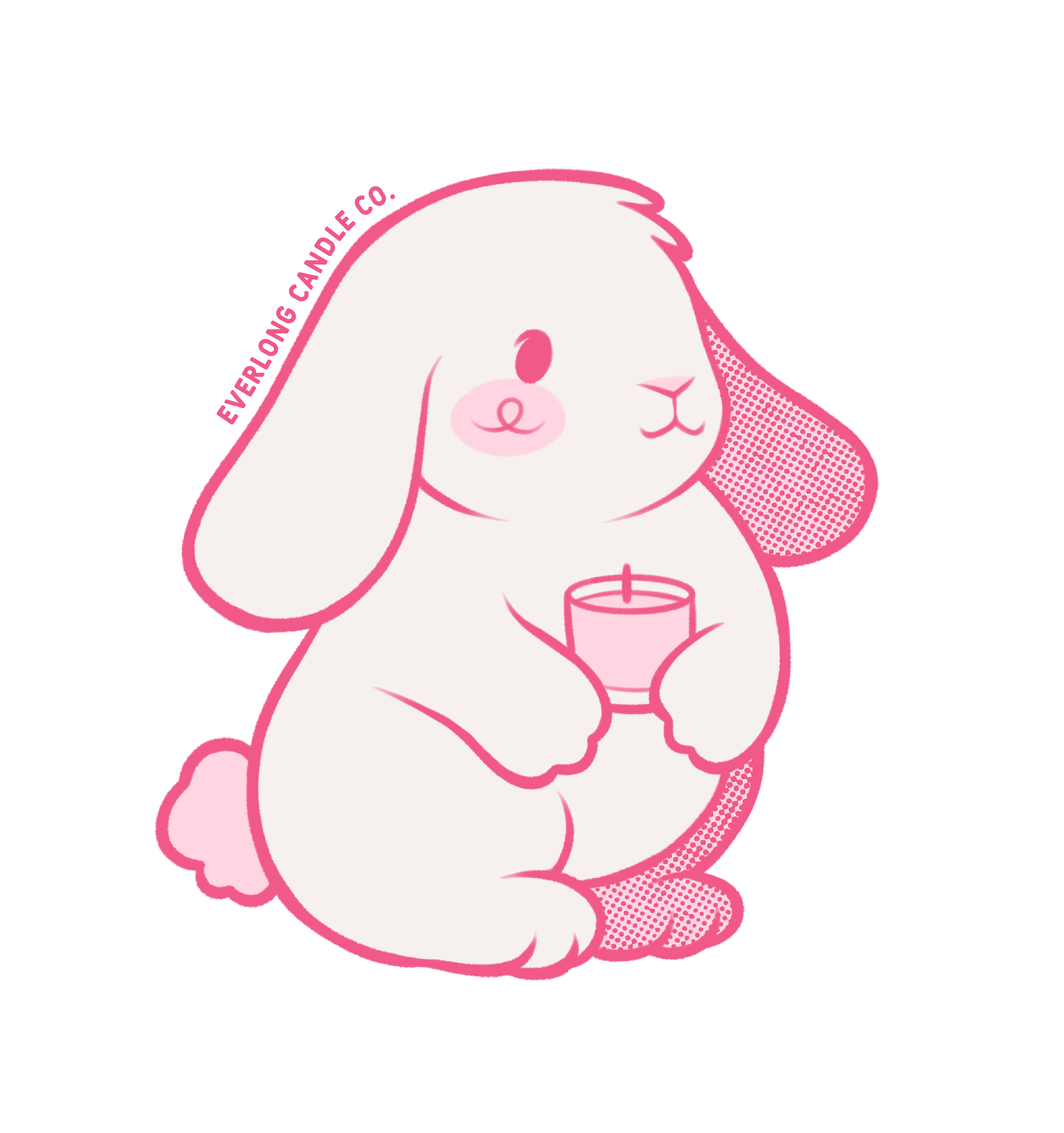
Bunny Sticker
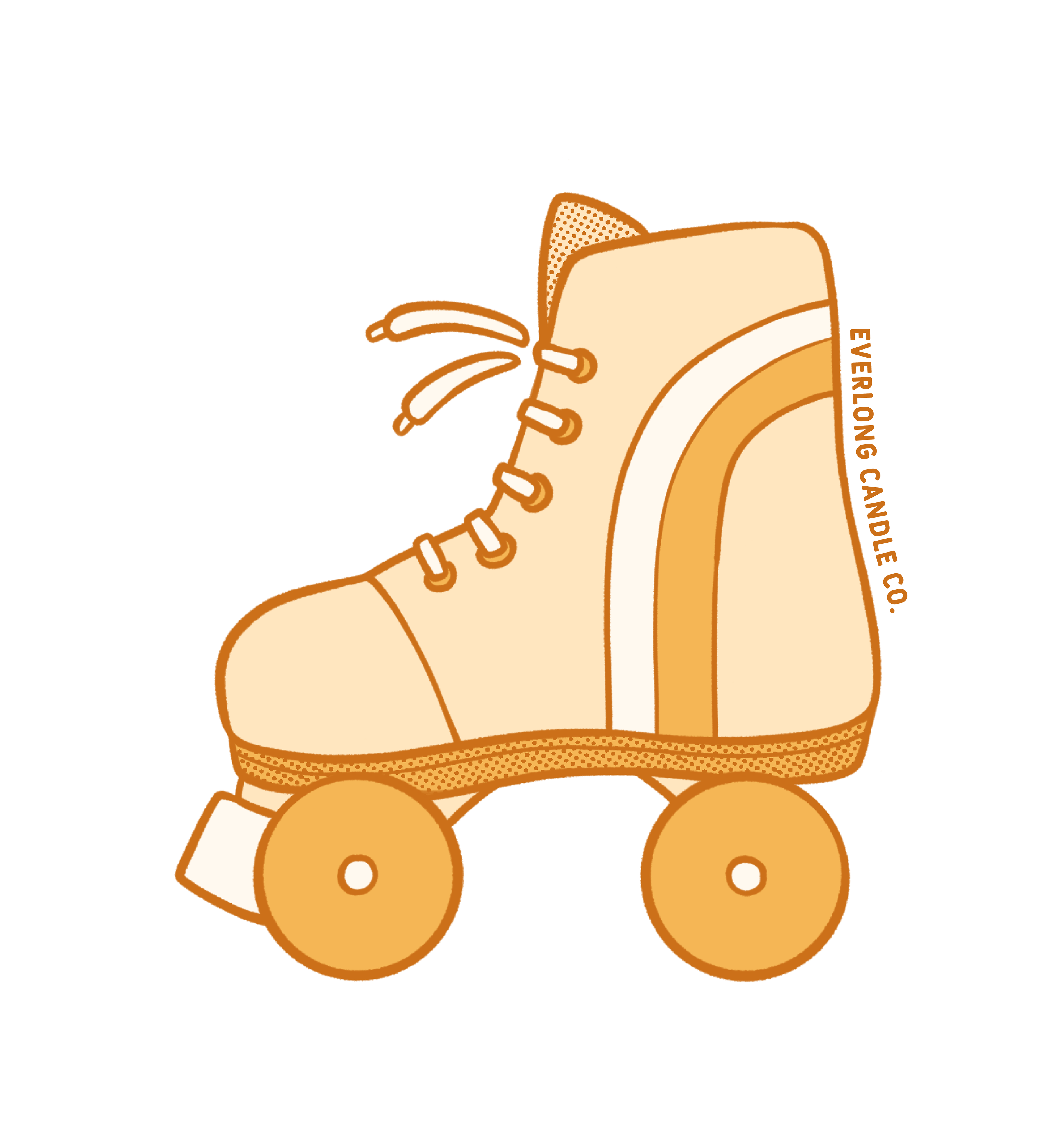
Rollerskate Sticker
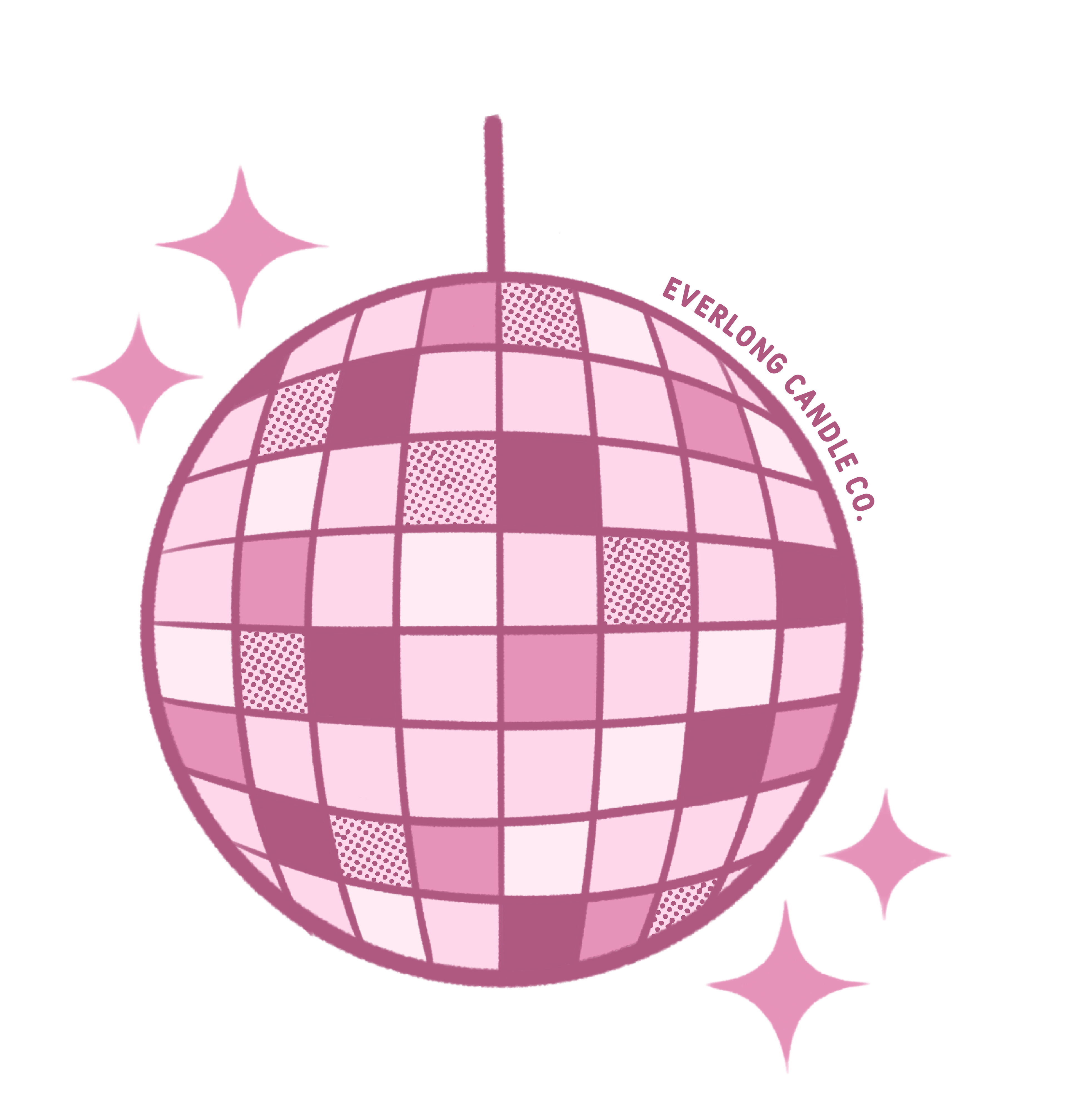
Disco Sticker
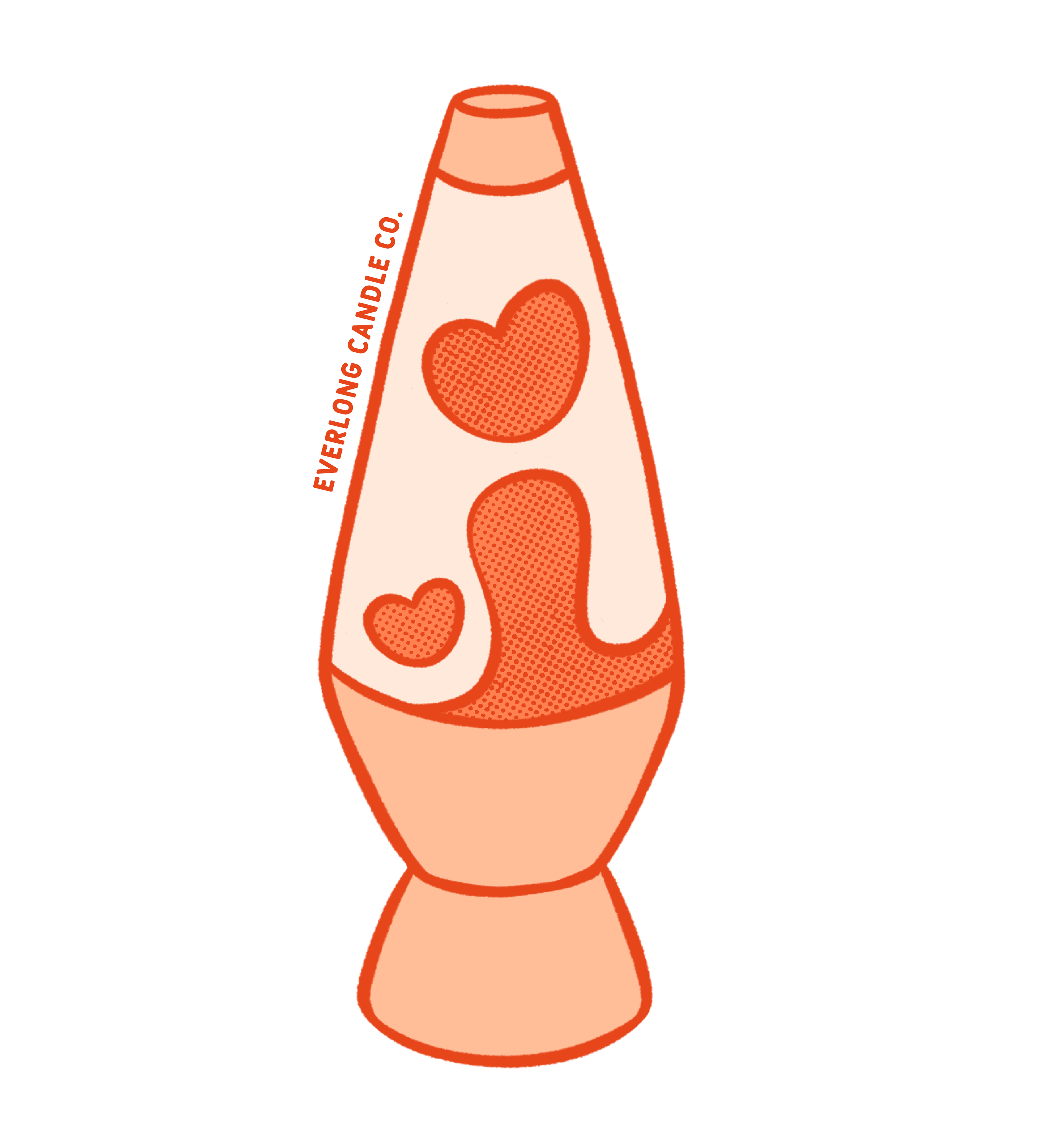
Lava Lamp Sticker
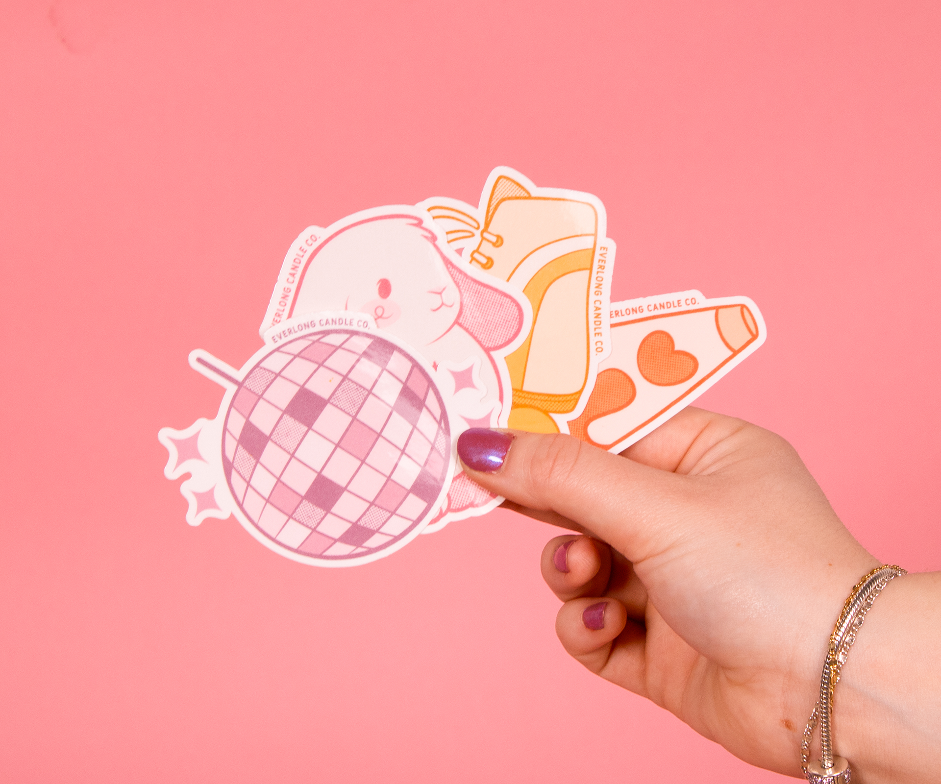
Sticker Collection Photograph
The sticker designs were created to build on Everlong Candle Co.’s existing branding, which embraces a chic, funky 1970s aesthetic. The bunny character was introduced to highlight the company’s love for animals and to reflect their commitment to donating a portion of sales to a local nonprofit animal conservation organization in Grants Pass, OR.
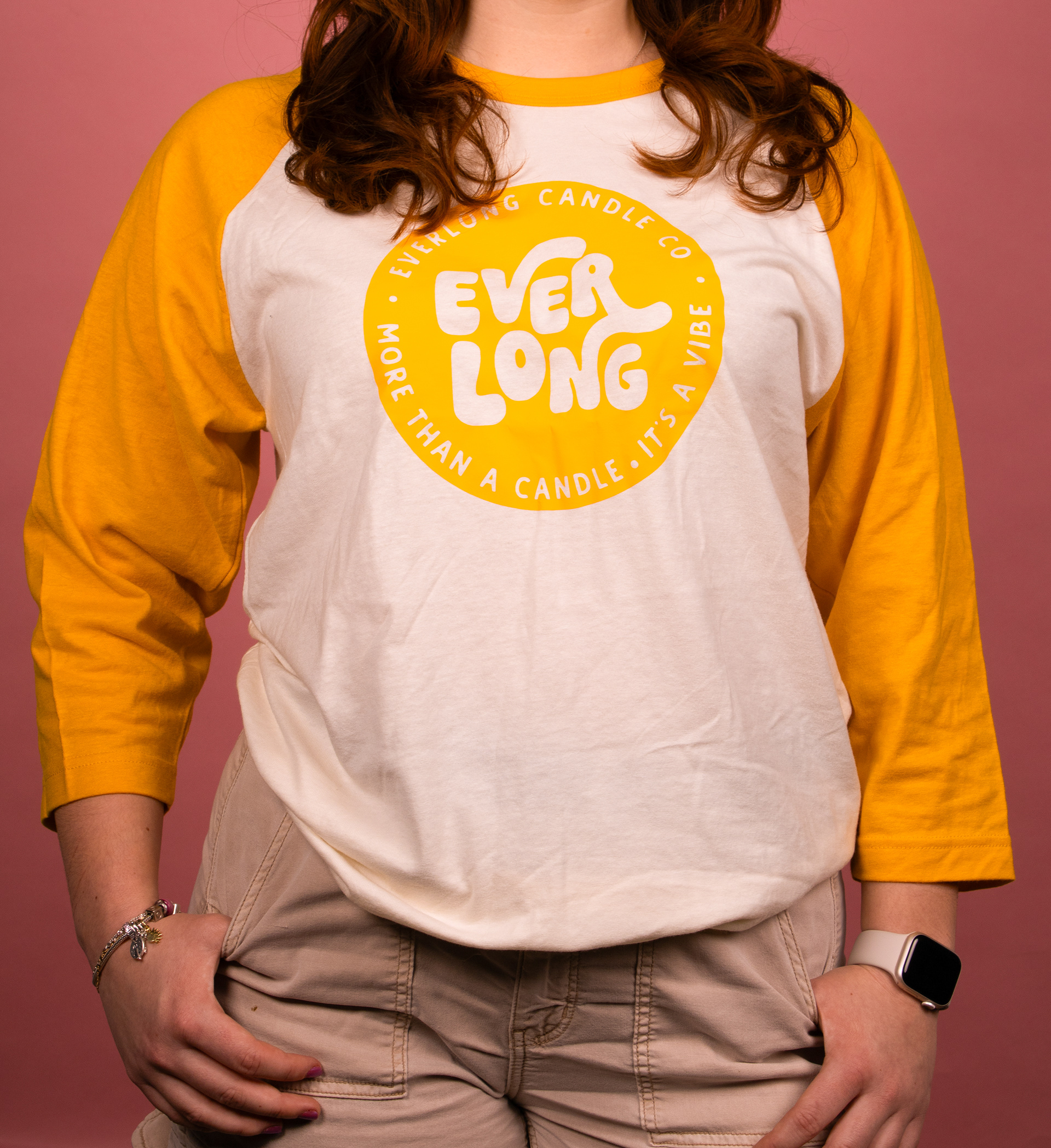
Staff Uniform - Front
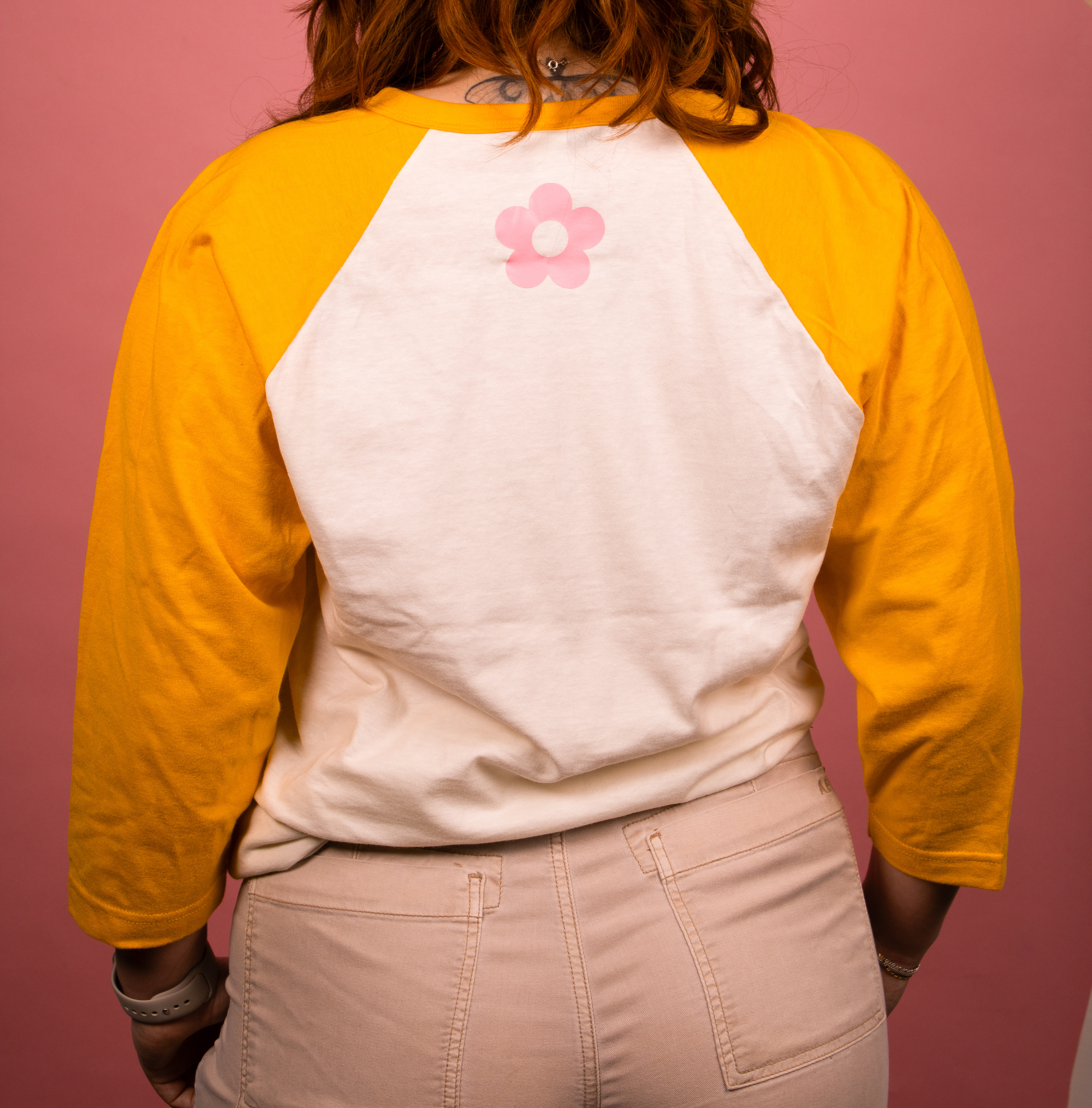
Staff Uniform - Back
The staff uniform simply uses the Everlong logo with a small flower graphic on the back to add in personality, yet still kept conservative to allow the product be the primary focus of the brand.
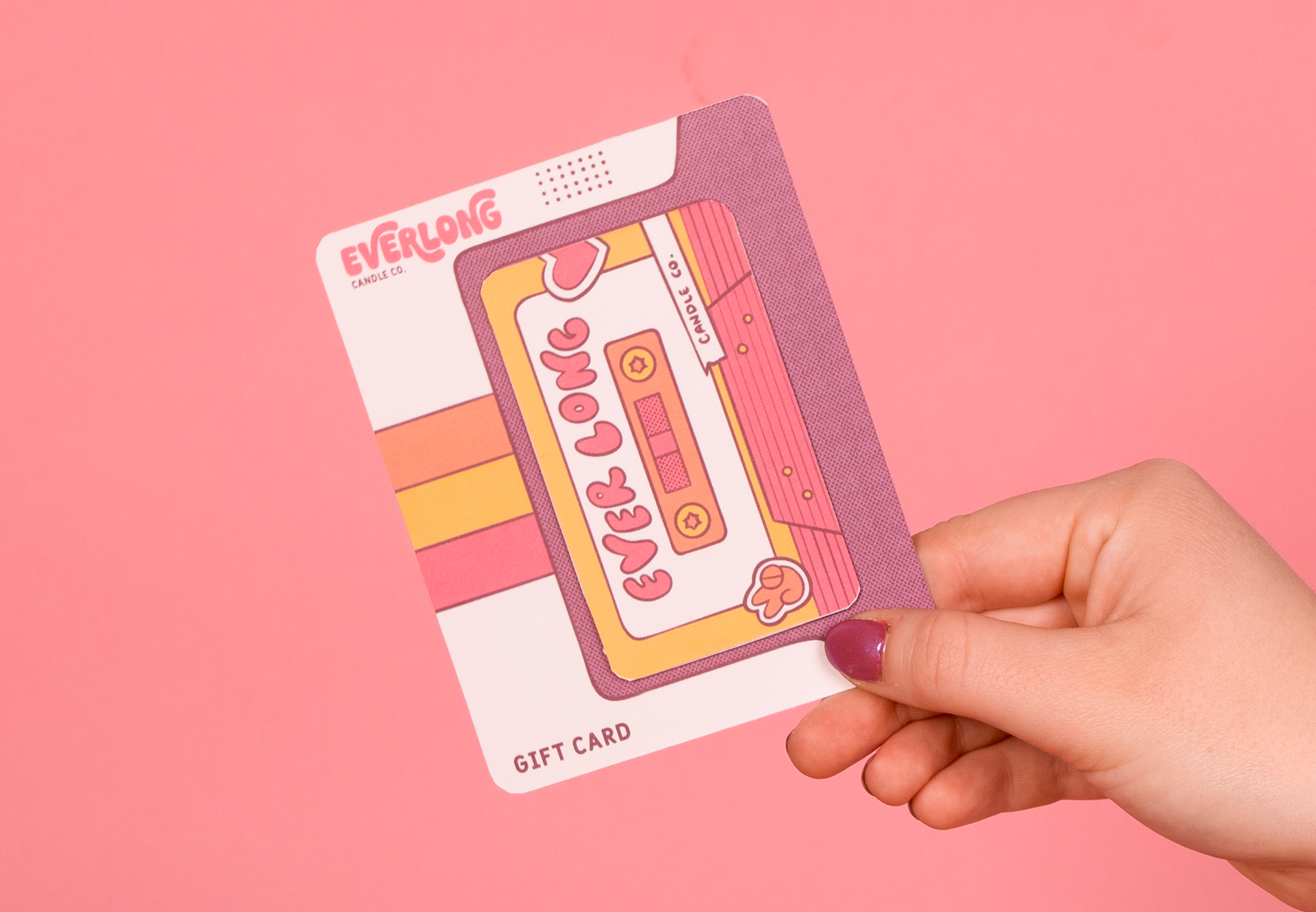
Gift Card Set
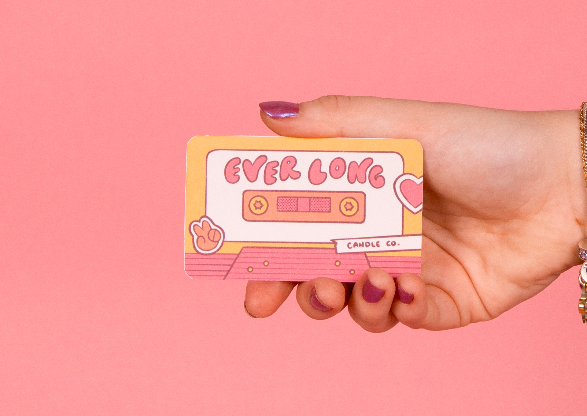
Gift Card Solo
The gift card was designed to play off of the look and feel of a walkman, a popular music listening device during the 1980s. The card is meant to look like a cassette tape, with some on-brand sticker decor.
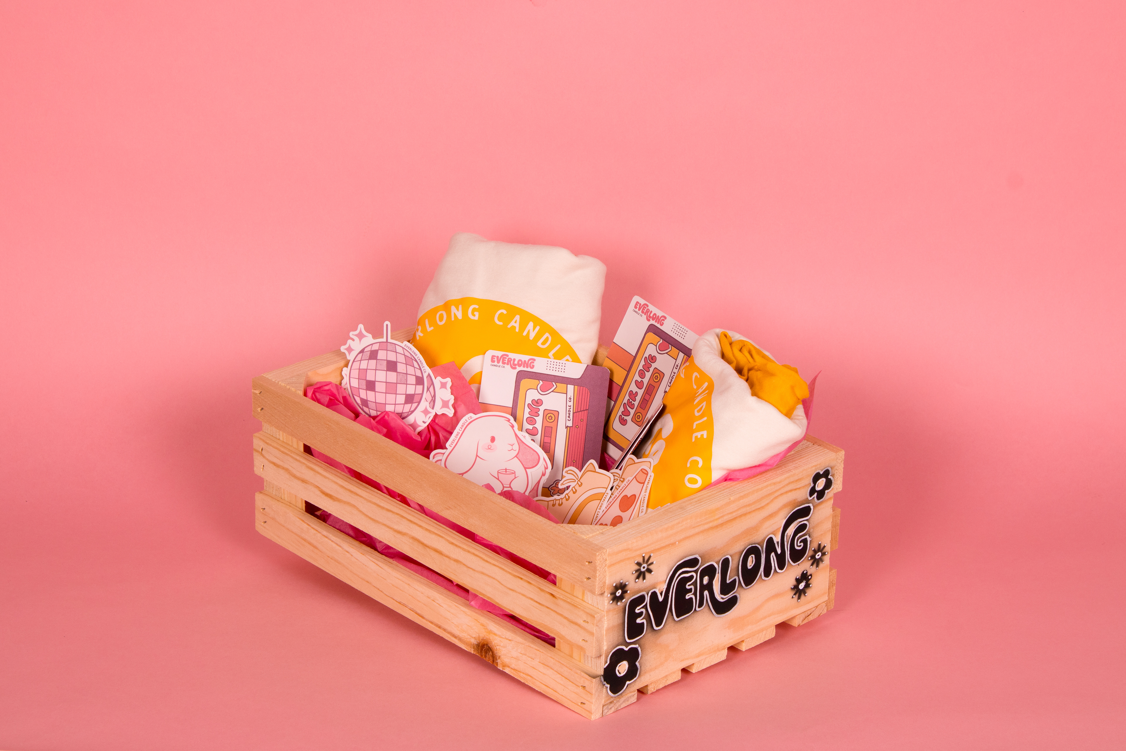
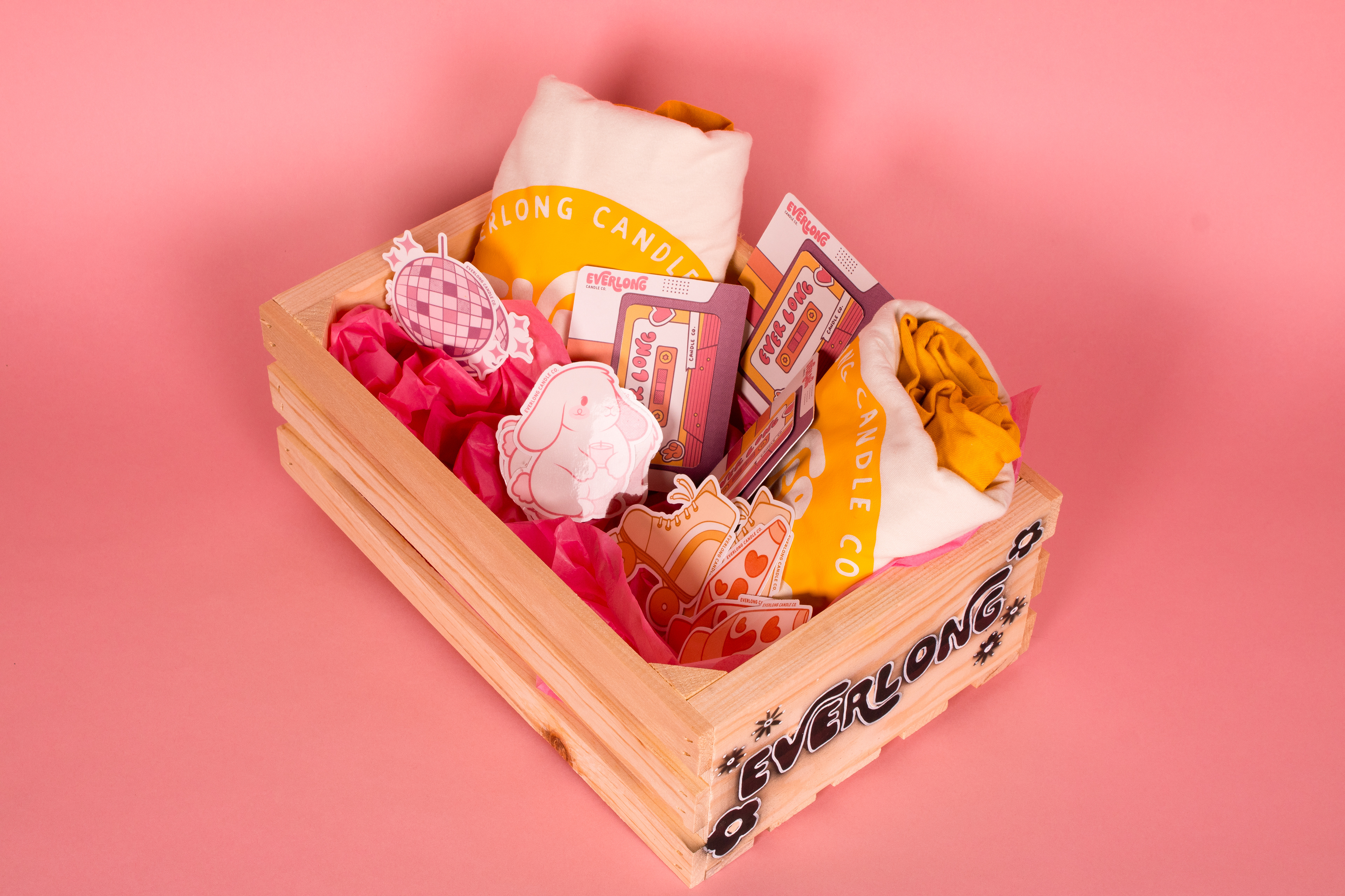
As a final send off to the project, we did a photoshoot of the newly designed products in a care package. This was then delivered to the Everlong Candle Co.!
PROCESS:
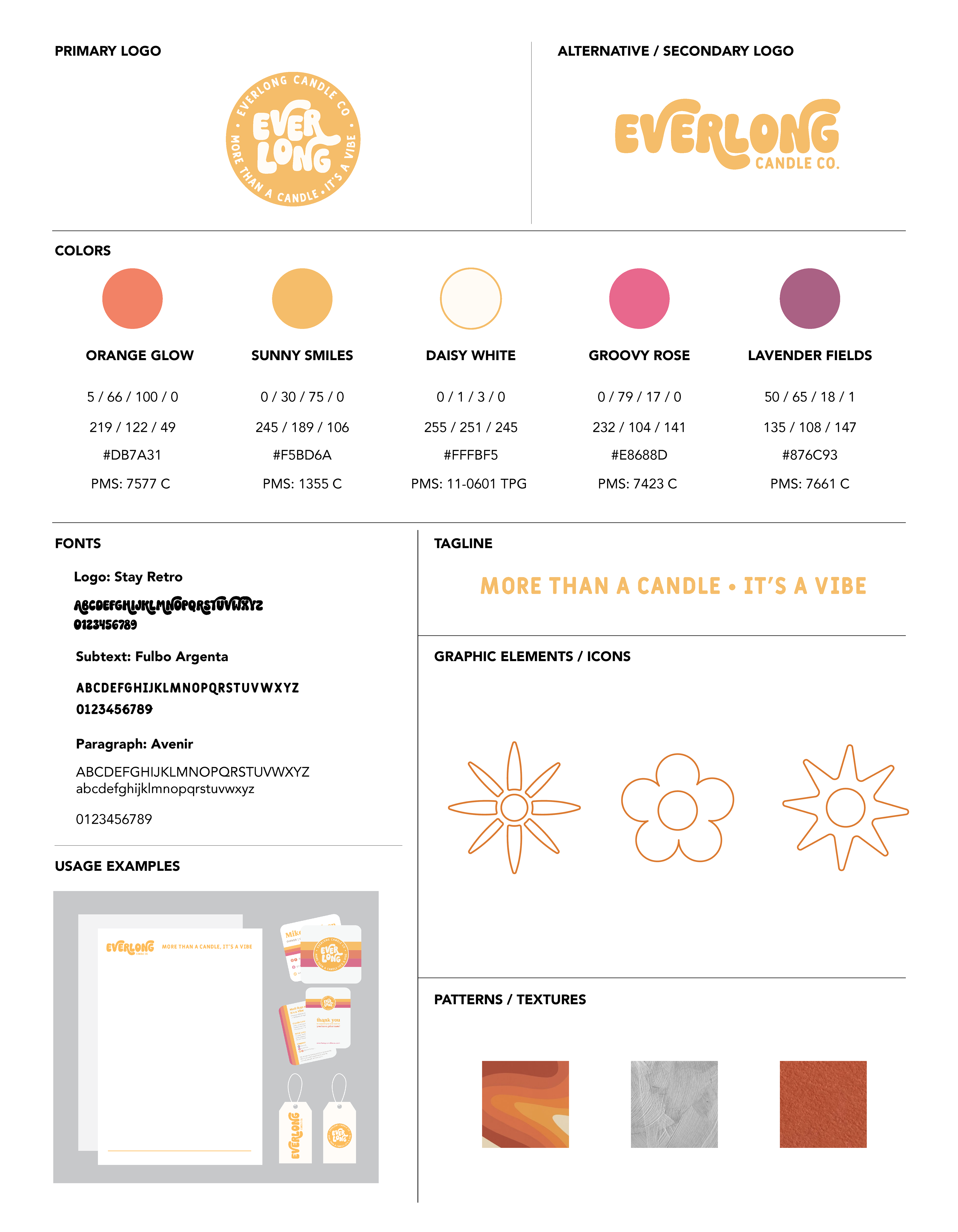
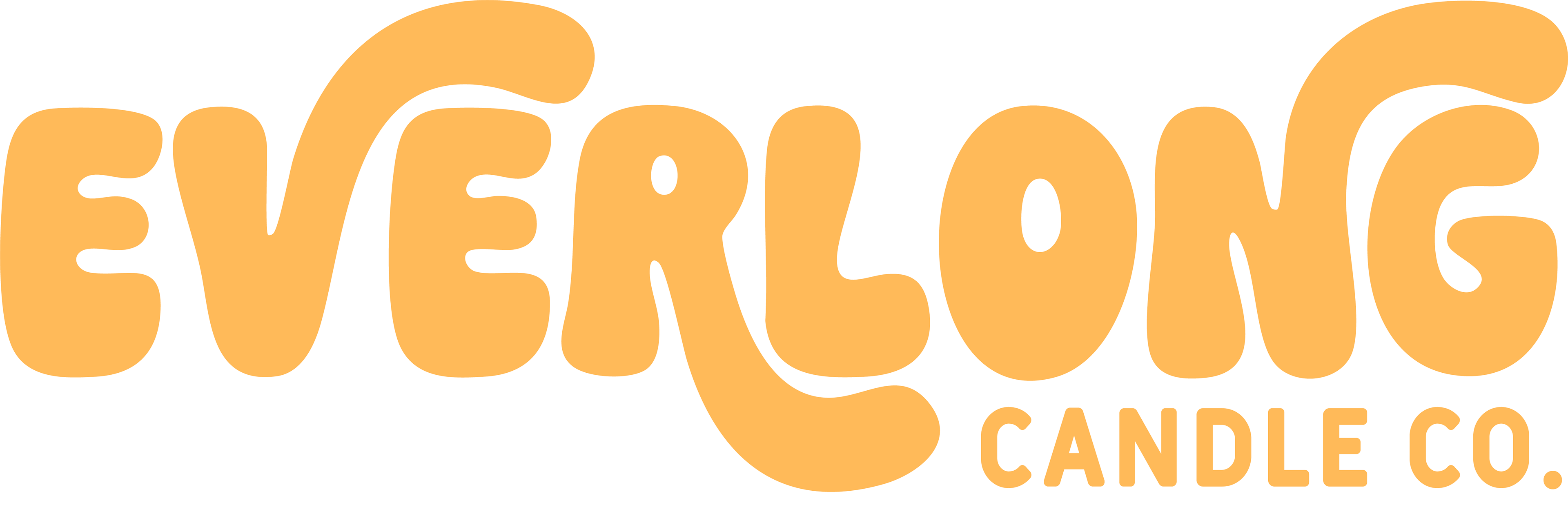
We began with creating a style guide for the company's brand to ensure we stayed true to it. This includes the brand's colors, fonts, graphic elements, textures, and usage examples. A primary logo was already provided, but there was need to create an alternative/horizontal variation. Beyond an additional logo, the team and I formed graphic elements/icons that could be included in the branding to help elevate it further.