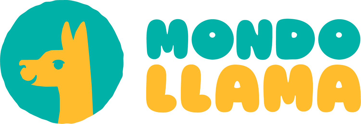
PROJECT OVERVIEW:
Mondo Llama is a Target exclusive arts and crafts brand whose main audience is younger children between the ages of 3-12. This project focuses on rebranding their company to create an identity that matches their values and tone of voice.
The original wordmark for Mondo Llama focused more on the "building blocks" of imagination. While I do think this conveys their goal, it was a missed opportunity to add an animal mascot to a children's product. A llama icon would draw consumers in more and make the branding unique.
Original Wordmark
IDEATION:
The ideation for this project was to use Mondo Llama's keywords: Colorful, Fun, and Accessable. Mondo Llama prides themselves for creating affordable craft materials that not only work, but look high quality. The final product highlights these key values with the use of color, typography, and graphics.
DELIVERABLES:
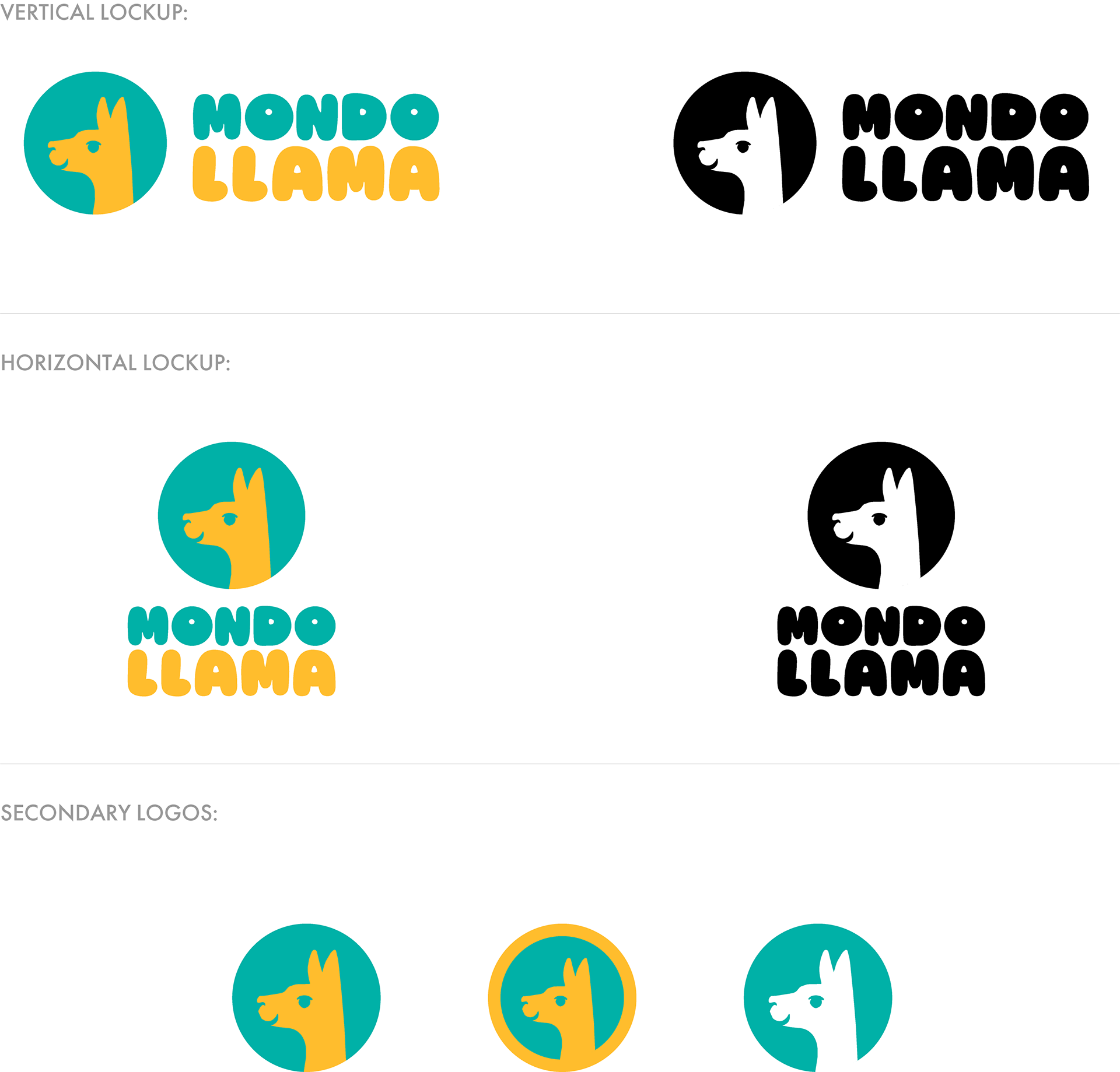
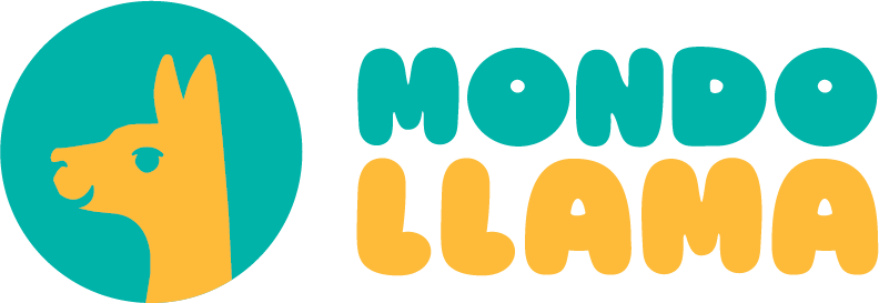
Mondo Llama Logo Lockups
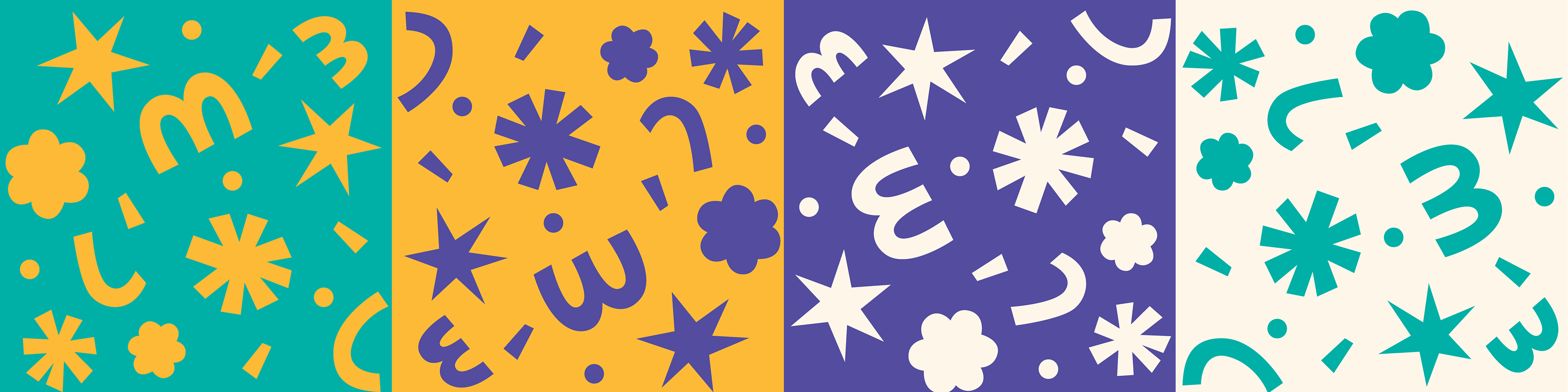
Brand Pattern Concept
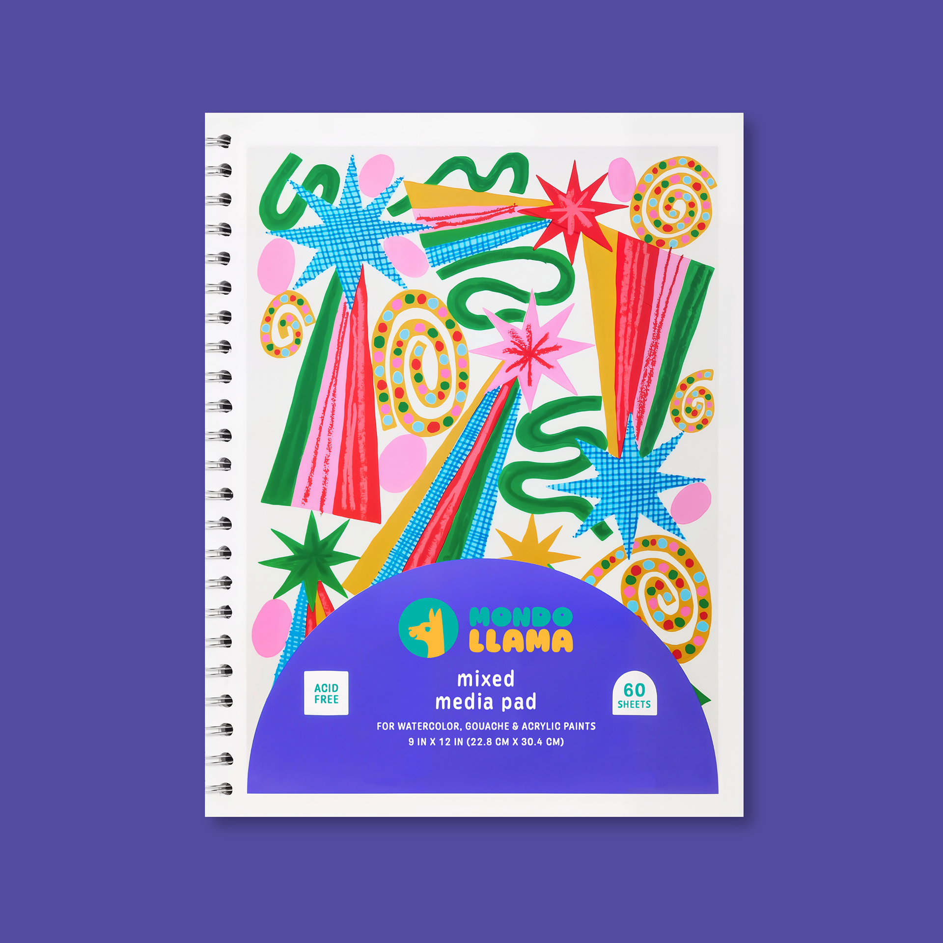
Sketchbook Mockup
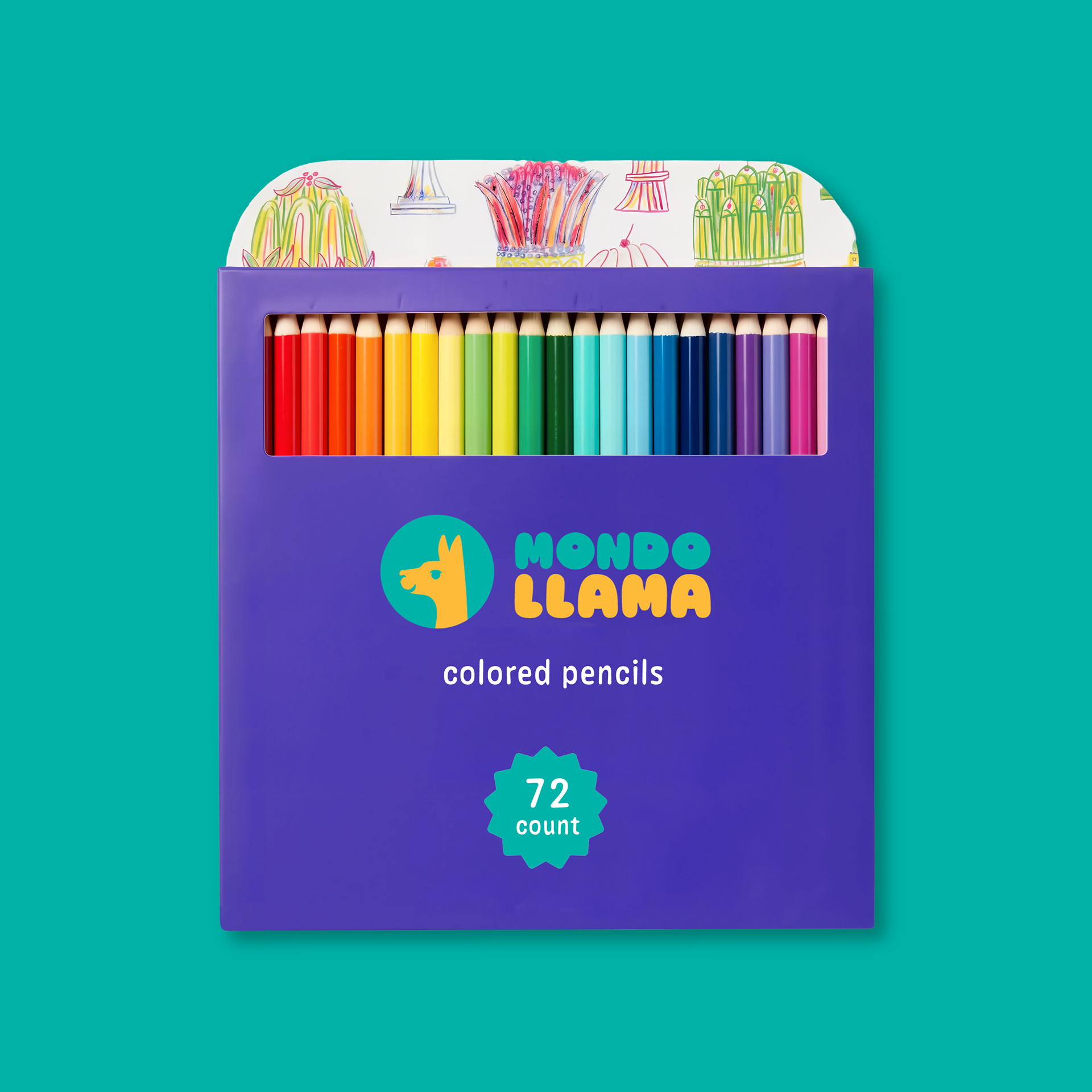
Color Pencils Mockup
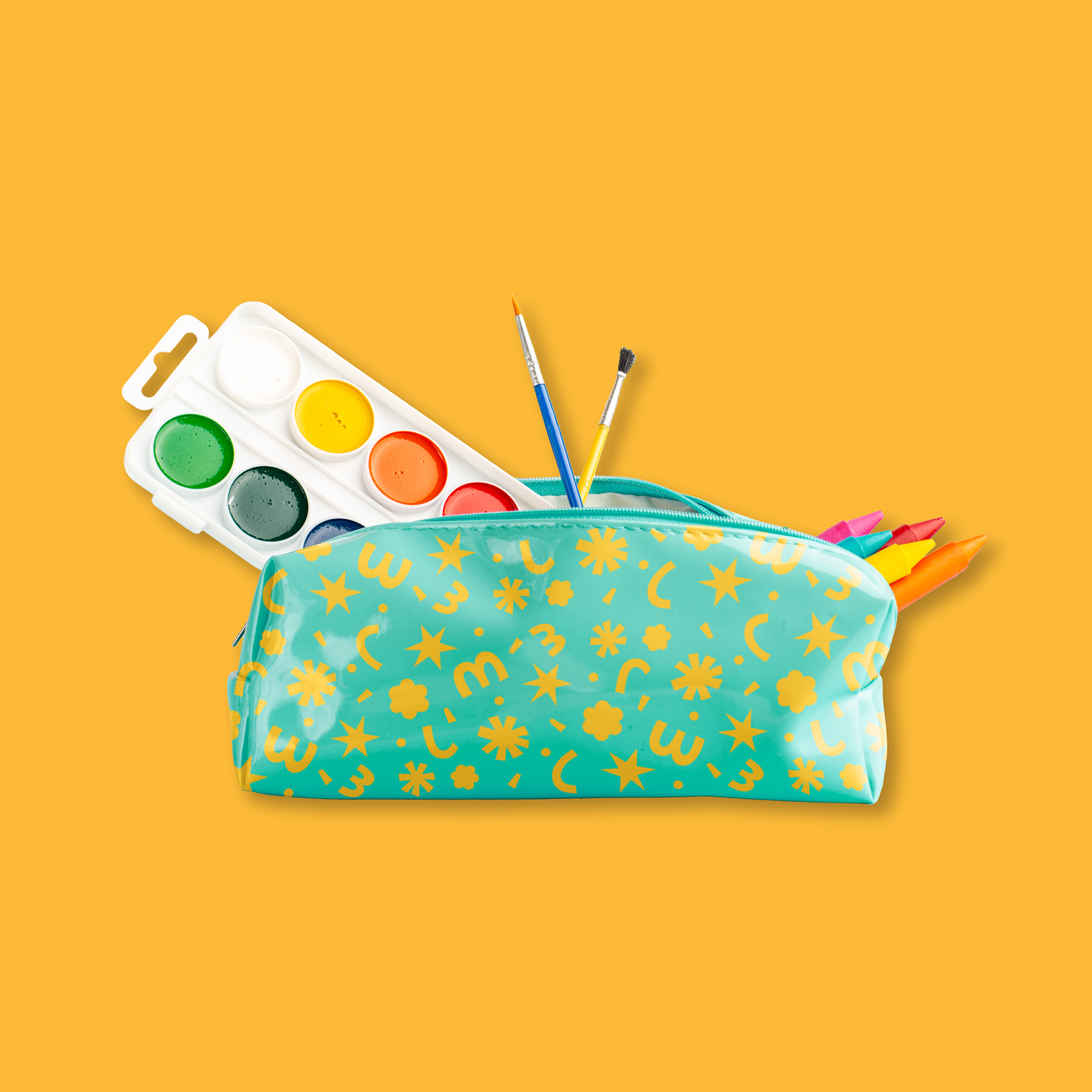
Pencil Case Mockup
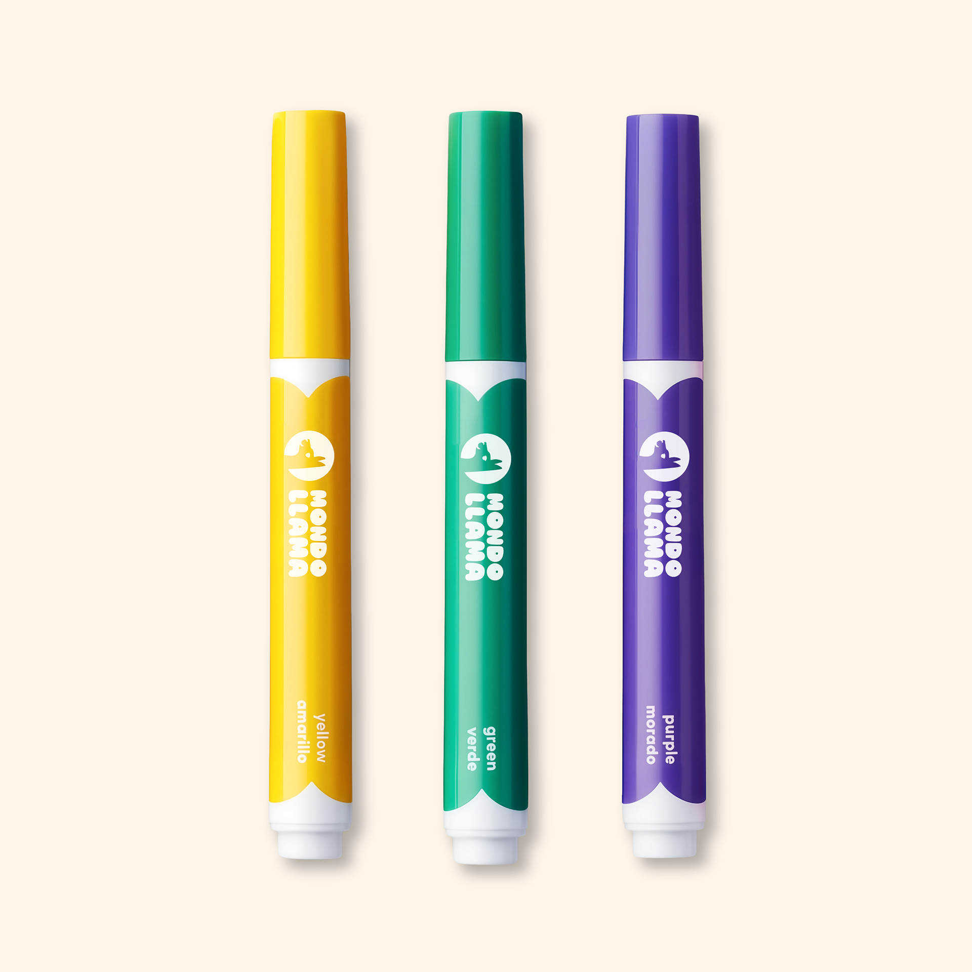
Markers Mockup
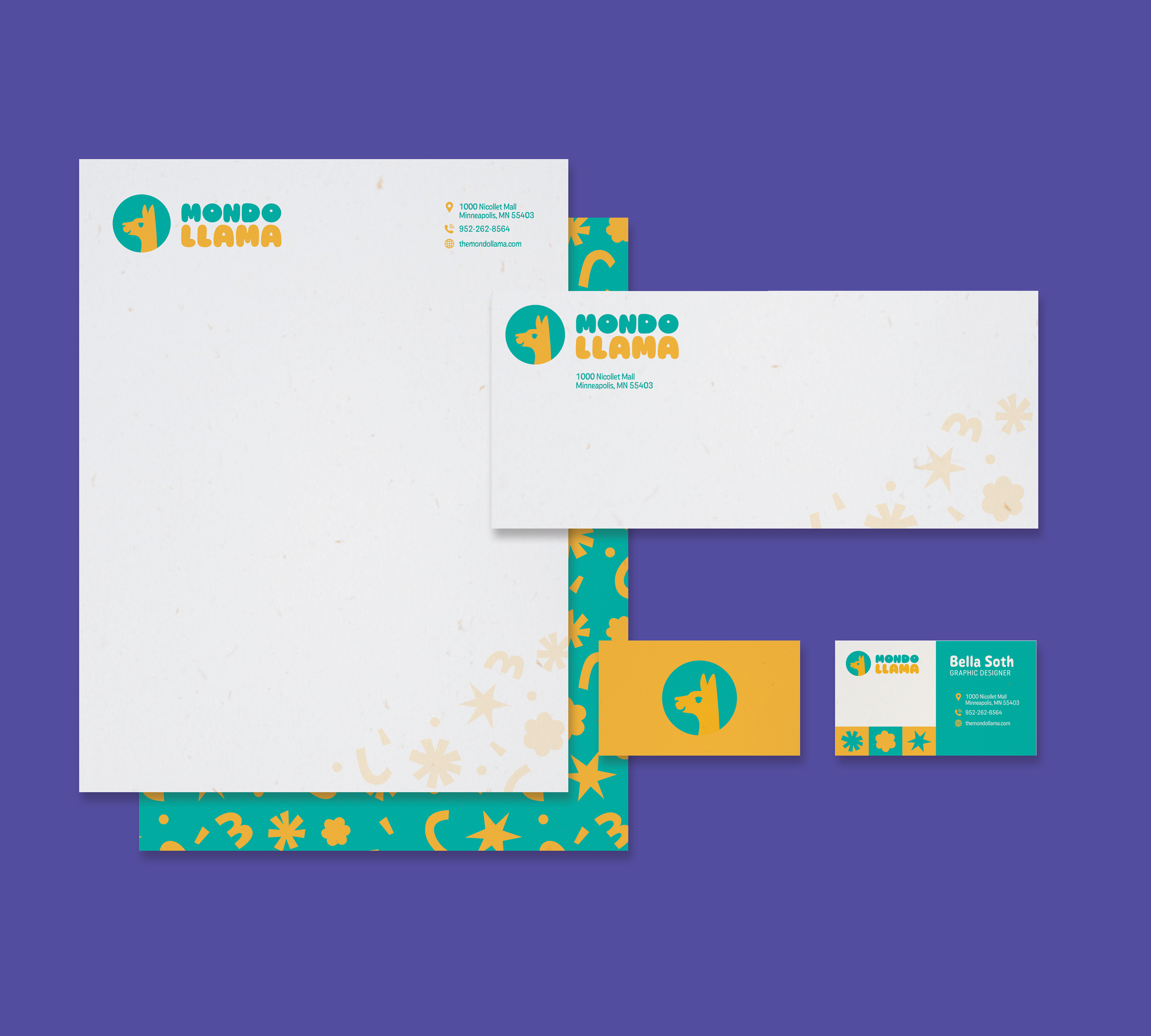
Stationary Mockup
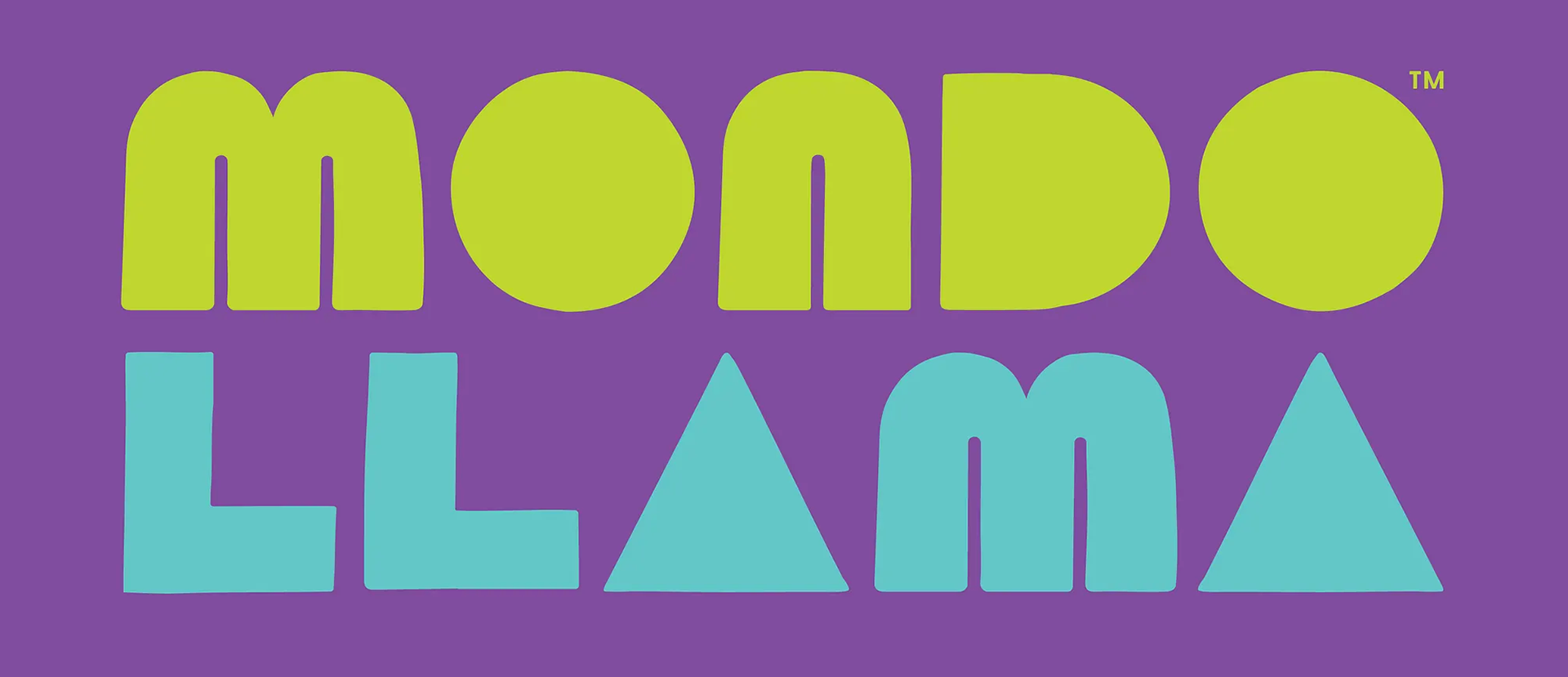
The final result of the deliverables encapsulates the fun and quirky energy of Mondo Llama. The rounded typography has a welcoming personality that matches with the llama graphic. The colors chosen for the logo are eye-catching and playful, emphasizing the brand's tone-of-voice. To expand the brand even further, a pattern was designed that uses both the "M" and "L" in Mondo Llama. It's reminiscent of crafts and confetti.
PROCESS:
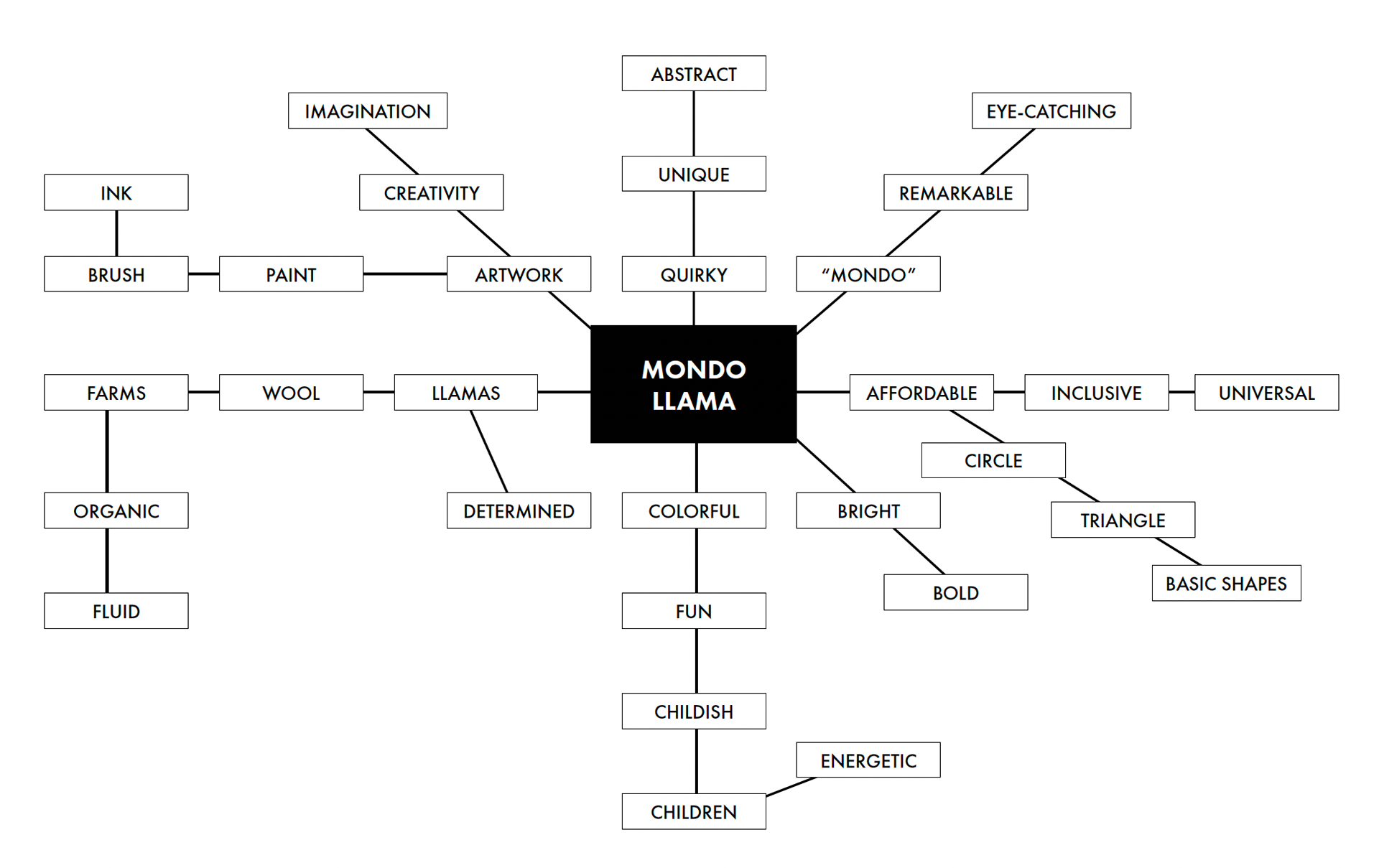
Mondo Llama Mindmap
Before the creative process began, a mindmap was created to generate ideas. Many of the words are centered around artwork, colors, and the quirky energy Mondo Llama tries to bring to the arts and crafts market.
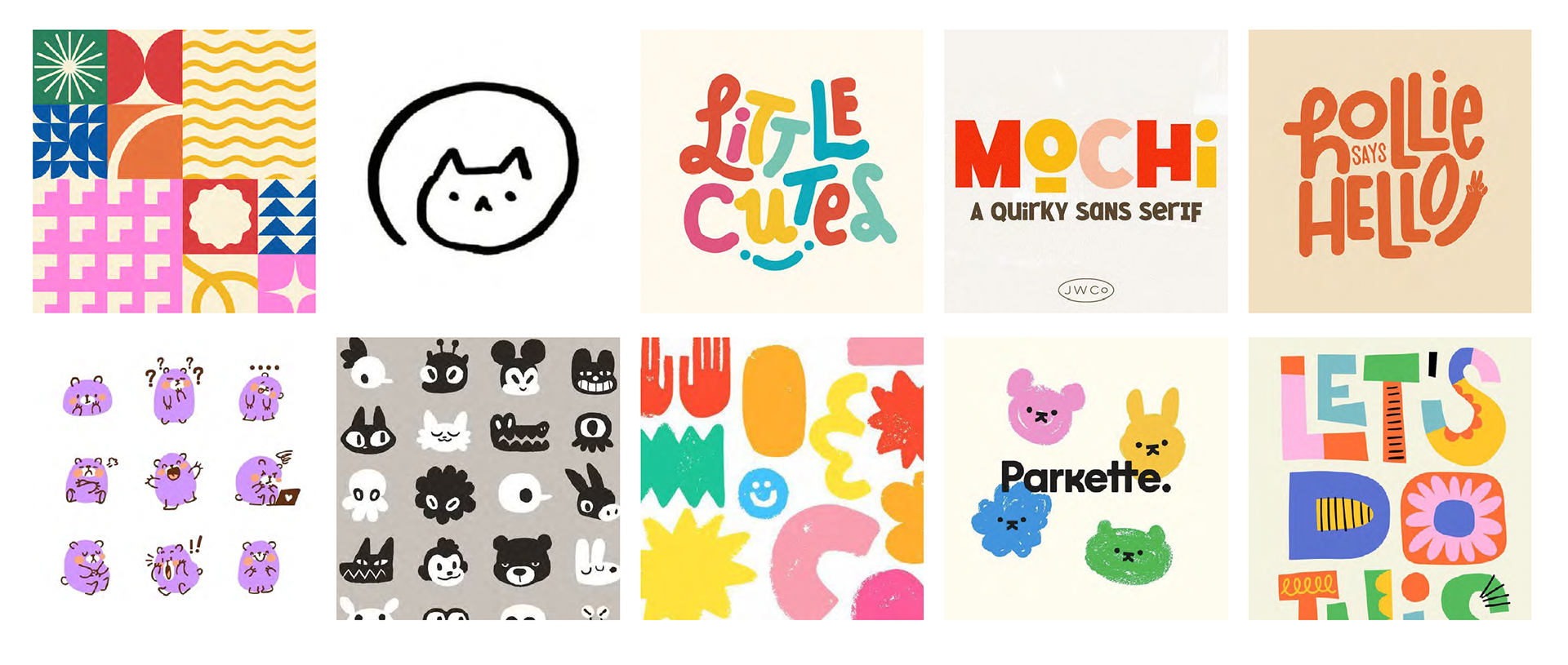
Territory Board
This mindmap was used as a reference to form a cohesive territory board. This helped build the look and feel of the rebranded Mondo Llama branding. The goal was to have the branding feel childish, but still modern and structured so it felt high-quality.
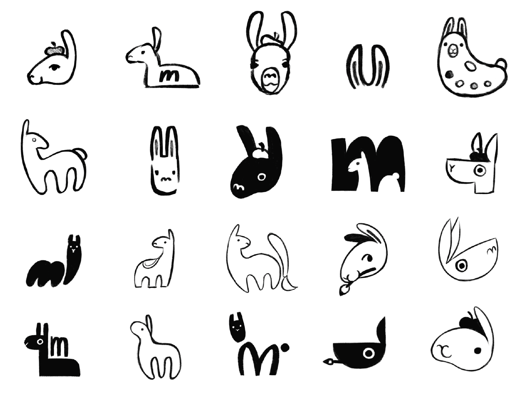
Logo Sketches
With the mindmap and territory board done, it was time to begin the design process. At the start of this project it was decided that the llama needed to be apart of the logo, so 20 different sketches were explored. Each takes takes into account Mondo Llama's values, and the territory board. Different shapes, compositions, and weights were explored.
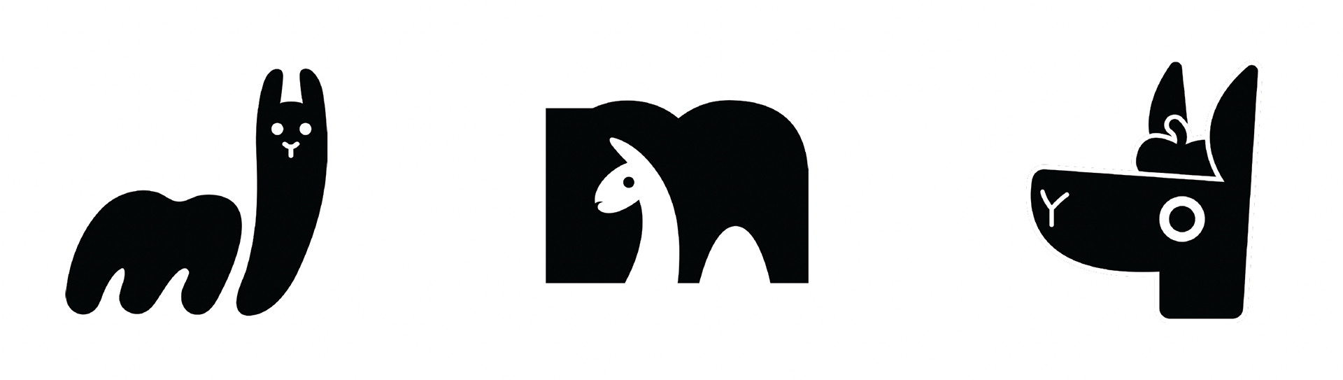
Logo Progressions
Three out of the 20 sketches were further progressed. Each of them convey a similar feeling, but in varying styles: organic, structured, and personal. For the final direction for the logo, a combination of the middle and right design were used.
Mondo Llama Beta Logo
This was the first iteration of the final direction for the logo. This concept tried to explore a rougher, more imperfect look with the bounding-circle and llama figure. This was soon scrapped in order for the typography of the logo to match the graphic.